The 2021 New American Remodel: Landscape Lessons
While each year’s New American Remodel is one of a kind, the projects are all linked by a common thread. Each one of these homes offers ideas on how to combine best practices in architecture, construction, and product choice to create beautiful living spaces that are comfortable, healthy, and energy-efficient. And each one is held to the highest standards of home design.
That vision always includes the outdoor living spaces, which is no surprise for this Orlando home (or for the previous two New American Remodel projects in Las Vegas). This year, though, called for special attention to the ways in which the outdoor spaces related to the house itself.
With more homeowners than ever interested in outdoor living, every remodeler can learn useful lessons to use in their designs from the New American Remodel team’s approach.
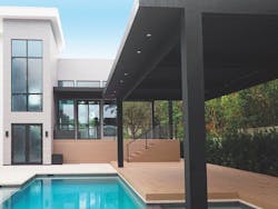
In some homes, the most interesting architectural features are at the front, but if a homeowner is going to spend a significant time in their backyard, that rear facade is just as important as the front elevation. That’s why E2 located the home’s stairwell so that it faced the outdoor living area at the back of the house, cladding its walls with dark fiber cement instead of white stucco. A large pergola from StruXure Outdoor was been placed over the pool area while a smaller one covers the entry deck overlooking the pool. It includes louvers that can be adjusted via a remote or a digital app.
Collaborative design inside and out
What made the relationship between indoors and outdoors so important was the home’s modern architecture. But what made it possible to maximize the impact of that relationship was a good design process.
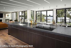
Consider views, for instance. All modern homes have an abundance of glass but the New American Remodel had more glass than usual—it accounted for more than one-third of the home’s exterior wall area. All that glass made it important that the design team be intentional about views from the kitchen, living room, and bedrooms.
The key to getting attractive views was a collaborative approach that took a variety of perspectives into account. E2 Homes, the design-build contractor on this project, sought input (as it always does) from the architect, the interior designer, and the landscape architect at the beginning of the design process. All of them had a say in the structure itself.Of course, collaboration is a bit of a buzzword these days. You can find countless articles about its benefits in the business press, and a lot of companies at least give it lip service, even if they’re somewhat less convincing in its implementation. In a large remodel, collaboration can be a particular challenge, perhaps due to budget or time constraints. Still, E2 Homes seems to have figured it out.
“A lot of remodelers don’t call me in until the home is almost finished,” says landscape architect Denise Smith. “With E2, though, I always collaborate closely with the architect and interior designer from the very beginning.”
Framing the Views with windows and doors
On this project, that collaborative approach led to several design changes. Modern architecture’s inclusion of big windows and doors makes for big views. But “big” is not inevitably “good,” which is something Smith well understands. When you see a certain square of sky through a window, it may seem endless, but widen the window two feet and the transformer spilling power lines ruin the illusion. To manage this, you must “frame,” or choose the view, directing people’s attention the way you would with a photograph or painting. Smith says that this type of framing can help make a modern house feel more intimate.
The need for good framing of outdoor views is one of the arguments for getting the landscape architect involved while the floor plans are being drawn. The landscape architect can think through the potential landscapes and vignettes and then work with other members of the design team to maximize the most captivating options. “I try to arrange views to show things people want to see and to hide things they don’t want to see,” says Smith.
How exactly does one frame views? The most obvious way is with trees. You can block the sight line to the neighbor’s trash bins by planting new trees, for instance. You also can open up views to a lake, stream, or shore by pruning existing trees. It’s a common practice that’s part art and part science.
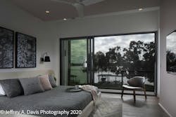
For example, some members of the design team wanted to remove a tree that partially obscured the primary bedroom’s view of the lake across the street. Smith convinced them that the tree was interesting in its own right, and that cutting it down would actually make the view less appealing. “I thought it was important to save the tree, so we compromised by removing some of its limbs.”
Big and small adjustments in an outdoor remodel
Smith also worked with the design team to align small windows, like those in the home’s baths. The goal was for the windows to provide eye-catching perspectives of the outdoors while adding aesthetic appeal to the exterior elevation.
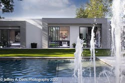
She even helped change a major architectural feature: the stairway that links the home’s five half-levels. In the original plans, a person looking out the stairway’s main window would be gazing directly at the pool deck’s hardscape. It wasn’t terrible, but it wasn’t particularly interesting, either. At Smith’s suggestion, the stairs were flipped so that the view from the stairwell would be of the splash pad, a fun water feature at the pool’s edge that includes a lighted fountain.
Other tweaks she suggested included a slight relocation of a deck at the side of the house, positioned to provide a better sight line to the lake. She also worked with the design team to relocate utility equipment to more discreet locations. “I don’t want people to have to look at air handlers, garbage cans, or pool pumps,” she says.
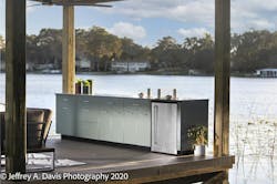
Docks can be used for more than just tying up a boat. This one serves as a social space and has been outfitted with a row of stainless steel cabinets from Danver. This dock is unique in that ratherthan lifting the boat from the roof structure, it has a hydraulic lift below the decking. The lift required some custom engineering, but with less structure needed overhead, there’s more ceiling height and a sleeker roof line.
Using transitional spaces in an outdoor remodel
The landscape architect’s input can also help ensure good flow between the interior and exterior. Smith worked closely with interior designer Rob Turner on the connection between the covered and the uncovered pool area. “The pavers are continuous. They’re the same in the lanai and around the pool.”
They also collaborated on the transitions from the house to adjacent deck and patio areas. Ground floor openings are flush at grade, and the concrete pavers and interior floor tile have similar colors and textures. As a result, these adjacent spaces feel related.
Smith suggested lowering the slab in the entryway at the front of the house, a detail we wrote about in our last issue. “Lowering the slab brought it down to driveway level, which created a flush entry,” she says. “That helped create a nice, inviting front door.”
And she had a major say in the design of the pergola next to the backyard pool. “I thought a pergola would make for a more interesting view across the pool from the lanai and would also help screen the neighbor’s property,” she says. When someone is looking at the house from the backyard cabana, the pergola also softens the size of the house.
Drought-tolerant plants to artificial turf
As is true with all outdoor spaces, turf and plants were important in the New American Remodel project. And when it came to those elements, the priorities included sustainability and maintenance.
Part of E2’s brand is a commitment to minimizing its projects’ environmental impact. That impact obviously includes water use, which drives a preference for drought-tolerant plants native to the local area. Native plants also give the home itself a distinctive appeal. “They really help seat the house in its surroundings,” says Smith.
A desire to conserve water inevitably raises the question of grass. Most people want at least some lawn area, but even native grasses can demand a lot of water.
To minimize watering needs, Smith insisted that artificial turf would be a good choice for the grassy area between the pool and the cabana. What sold the homeowners on the idea was its long-term value. “The artificial turf cost three times as much as sod would have, but the homeowners will save on water and on maintenance costs,” she says.
Many artificial turf products offer a lifespan of up to 20 years. Although most people won’t want this product everywhere, artificial turf can be an effective solution for difficult spots. For instance, artificial turf can provide the look and feel of a lawn in a shady area that doesn’t get much sun or where tree roots create a tough growing environment for real grass.
Regardless of the plants used, all trades will need to be told and shown how they can support the project’s emphasis on creating a sustainable landscape. E2’s electrical subs, for instance, know that it’s not acceptable to cut tree roots when running conduit.
Smith says that making the landscape architect a critical member of the design team need not bust the budget. “On a lot of jobs, by the time you near the end, there’s not much money left for landscaping,” she says. “But if the clients intend to use their outdoor spaces, it’s important that those spaces look good, function well, and are easily maintained.”
After all, she says, a design approach that views a home’s outdoor spaces as inseparable from the house itself gives homeowners true value for their remodeling investment.
Charles Wardell is a freelance writer and former remodeler in Tisbury, Mass.
