Photo: Sal Alfano
This article, which first appeared on the Hull Historical website, is adapted from an article on the ProTradeCraft.com website.
Crown molding is a common trim upgrade that can really make a room pop. You can easily create elaborate cornices by combining different pieces of molding for a “built-up” look. It’s a great way to get more from less, but it’s also a common way to make a clean wall look muddy.
Lucky for us, there are rules for molding that were literally carved in stone a long time ago. This article draws on those tried-and-true forms to present three design rules for crown molding.
RULE 1: The parts should reflect the whole
A quick review of the classic architectural tradition shows a unity and harmony of parts. The ancients viewed the human body as the model for design. Just as hands, feet, arms, and legs are proportionally related, so too in ancient buildings are the parts related to one another—both in style and proportion.
Your forearm is 1.6 times longer than your hand; each knuckle on your fingers is 1.6 times larger than the previous one. This 1:1.6 ratio is called the Golden Ratio, and the ancients used it as the basis for rules of architectural proportion.
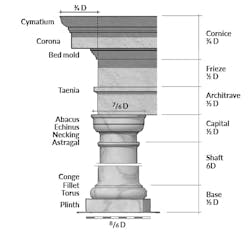
A look at the Tuscan order (below) shows this proportional relationship at work. All the parts of the order relate to the column’s diameter, which is labeled “D” and defined by the scale at the bottom of the diagram. The height of the base, for example, is ½ D, while the shaft is 6 D. The capital, architrave, frieze, and cornice also are based on the diameter of the column.
Crown molding on a wall corresponds to part of the cornice of a column. But you can’t measure the diameter of a wall, so you have to back-calculate that dimension to determine the ideal height of a crown molding. For a 96-inch-tall wall, the formula is:
96 = Base (½ D) + Shaft (6 D) + Capital (½ D) + Architrave (½ D) + Frieze (½ D) = 8 D
D = 96 ÷ 8 = 12 inches
For the Tuscan order, the cornice (¾ D) should be about 9 inches tall.
As you can see in the illustration, the Tuscan cornice is made of three moldings: Cymatium: (½ D), Corona (3/8 D), and Bed mold (¼ D).
Think of crown molding as a section through the cornice of a Tuscan column. All of the parts are proportional to one another based on the diameter of the column as defined by the scale along the bottom. Illustration: Matt Jackson and Dan Morrison
RULE 2: Pause to reflect
There are other orders, too, and the moldings that are used to make the various parts is not a crap shoot. They are predictable.
White space matters. Notice how many flat-plane surfaces make up the entablature in the illustration above. These flat surfaces are not places where the ancients forgot to add profiles—they are deliberately inserted and play a purposeful part in the overall design.
Moldings are a language. They communicate and have personality. Really. Try to visualize the flat-plane areas as pauses, or breaks, between words in a sentence. Insteadoftalkingreallyfastandnotpausingtotakeabreath.
The flat areas help our eyes read the moldings and understand what they are saying.
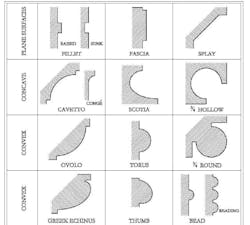
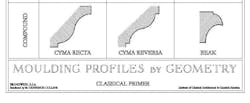
This sheet of classical molding shapes (below) from the Institute of Classical Architecture & Art begins with flat-plane surfaces—pauses that are designed into the classical language. Plane surfaces are as much a part of a good molding as are a cove or ovolo.
RULE 3: More contour is worse, not better
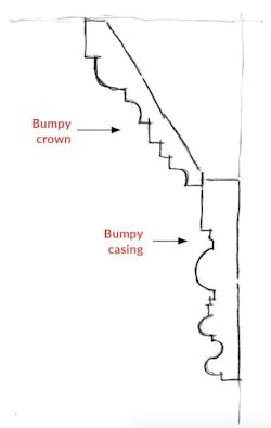
Over the last 20 years, molding—and especially crown molding—has morphed and mutated into silly, bumpy masses, often shaped with haphazard bellies, bruises, corners, and angles, all meant to look like many moldings were used. Some builders have begun to use two heavily figured moldings to make a crown look like it has six or seven smaller pieces—to make up a “masterful” cornice at a fraction of the cost.
This has grown from a misguided line of thinking that more moldings means more quality. Don’t be fooled. The drawing above is a sketch of an actual phony-crown that I saw on a jobsite in Austin, Texas. Even though it scaled nearly 9 inches across, it was made with just two bumpy moldings joined together. The angled upper piece is a new “super-crown” from a building supply store, and it’s packed with too many shapes. The lower molding is a busy door casing, and door casing is not crown molding (and it’s not baseboard, either). The proportion of the parts is all wrong. And there is no pause.
Moldings should be readable. In other words, their shapes should communicate a clear message. The parts of the message should be proportional to the whole.
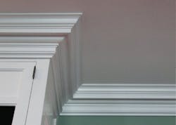
The photo (above) shows what good crown molding looks like. Unlike the bumpy super-crown in the sketch, this cornice is simple and easy to read. Note the pause (Rule 2)—the long, flat shape in the middle (the corona). We can read the composition because the pause gives our eyes a place to rest.
Note, too, that there is a harmony between parts (Rule 1): The sizes of the moldings are proportional to one another.
Bad crown molding is like an avalanche of dips and turns—except that avalanches follow the golden ratio, too.
Read more about Brent Hull's approach to timeless building.
About the Author
Brent Hull
Brent Hull is a master craftsman and nationally recognized authority on historical design and architecturally correct molding and millwork. He is author/co-author of four books, including his most recent, Building a Timeless House in an Instant Age, which is available at the website of Hull Historical, his Fort Worth, Texas-based company.

