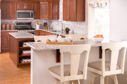
Expanding the Kitchen Triangle
As kitchens have evolved into bigger rooms with more activities and people, the original work triangle is joined by zones that serve multiple functions. Here’s how to make the parts work together seamlessly.
What's the triangle's origin?
When kitchens were built in new suburban communities after the Second World War, many builders designed them based on a single work triangle since the rooms often were small. The main appliances—refrigerator, range, and sink—were placed at the tips of a triangle to save steps. Anybody working could pivot from one appliance to another.
What are current NKBA guidelines?
As time went on, kitchens grew larger due to more people and stuff in them, from appliances to cabinets, countertops, an eating area, and island or peninsula. In fact, the room gradually became a family’s main gathering hub.
To accommodate the changes, the National Kitchen and Bath Association (NKBA), offered recommendations: no leg of the triangle should be less than 4’ or more than 9’. the sum of the three triangle sides shouldn’t exceed 26’, and no work triangle leg should intersect an island or peninsula by more than 12”.
What changes came next?
More recently, the larger kitchens have become busier, says designer Jodi Swartz of KitchenVisions in Natick, Mass. For family members, it’s a room to pay bills, do work for a job or school, charge tech tools, and access an outdoor living space, perhaps, with another, smaller kitchen.
For friends, it may be a place to hang out, mix a drink, eat or watch TV. “No longer is the room only about having a functional workspace, but is a place that offers an emotional experience—where good food is made, smells emanate, and conversations take place,” says Chicago designer Susan Brunstrum of Studio Brunstrum. As a result, multiple work zones are needed to supplement the main triangle.
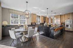
The kitchen has now become a space with many fuctions. Seen here is a multi-use area suitable for working or just hanging out. Jodi Swartz, KitchenVisions
Perhaps, family members love their morning coffee and have all the bells and whistles. Chicago kitchen designer Mick De Giulio of deGiulio Kitchen Design has designed coffee bars but is now seeing them morph into day-long beverage centers with an undercounter refrigerator, sink, and other accessories. JT Norman, in charge of business development, product and design innovation, Kitchen Magic, Nazareth, PA, has done the same. “They’re akin to a hotel lobby since many aren’t going out due to COVID-19,” he says.
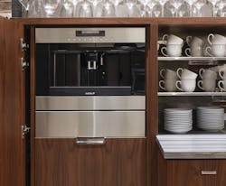
Increasingly since Covid, kitchens are designed so that homeowners can experience amenities usually found outside the home without leaving their front door. Abt Electronics; photo, Dave Burk
And then there are family members who bring work into the room to do at an island or table. The need for privacy to work has led to a separate nook, especially in open-plan designs, says Denise Benach, Director of Interior Design at Lexington Homes, a Chicago-area builder. She says it can be small—3’ by 5’—and efficiently outfitted with a work surface, shelves, outlets, lighting, and chair.
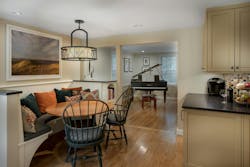
Many kitchens feature small, private work spaces, especially in open-plan designs. de Giulio Kitchen Design; photo Dave Burk
Some also like having a walk-in pantry to pare trips to big-box stores and a place to conceal small appliances that aren’t used daily. Benach has designed such spaces within a 5’-by-8’ footprint and lined them with open shelves so everything’s in view. De Giulio is increasingly outfitting “back kitchens,” which permit the main kitchen to be more pristine, he says. He is also brightening them with big windows.
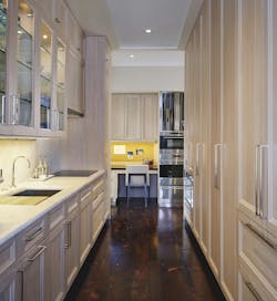
Still others want to simplify entertaining by placing a wine refrigerator, small sink, and space for glassware in a galley-style butler’s area between the kitchen and dining room, Benach says.
More eating areas are also being incorporated at an island or table, or both. As part of this trend, banquettes are back, says Brunstrum, who adds, “They are quite efficient as they can be used not just to eat/dine but to work, study, play games. and converse--great family time!”
If any zone is the nerve center, it’s an island where besides seating, spaces may be designated for a microwave to supplement the main range or ovens, the main or a secondary sink--which may call for a dishwasher, beverage center or wine refrigerator, and warming drawer. These days, some kitchens rate two islands—one for prep and one for entertaining, says Norman. Any well-designed island needs to be a minimum of 4’ long and 2’ deep, he says.
More and more kitchens are designed with two islands, one for prep and one for seating. Kitchen Magic, Photo, Christian Giannelli
Essential Do's?
For the main appliances, the same rules of decades ago apply. In a single-family home, Benach keeps a refrigerator, sink, and range within 9’ of each other. “You don’t want to carry a hot pot of water far,” she says.
Evanston, Ill.,-based architect Stuart Cohen, FAIA, of Stuart Cohen and Julie Hacker Architects, says that it’s key to reserve space for counters adjacent to or directly opposite each main triangle leg and auxiliary zone to set down ingredients or dishes.
