The all-white kitchen has practically become a design standard in remodeling as homeowners seek to emulate the squeaky clean renovations seen on HGTV. But as the pandemic influences design trends toward personalization and remodelers tire of designing the same kitchen over and over, there is an undercurrent of change in the industry.
“We went from white kitchens to the white kitchen with the blue island, and now we’re slowly seeing a shift into even more color,” says Michael Anschel, president of Otogawa-Anschel Design + Build in Minneapolis. “We’re already seeing gray replacing white and dual-tone and tri-tone kitchens emerging.”
Nearly a third of designer and remodeler respondents for the National Kitchen and Bath Association’s 2021 market outlook desire more color and style options for cabinetry, and two of the dominant trends seen at the 2021 IBSx included designs featuring mixed metals and bold colors. Even the 2021 Houzz Kitchen Trends Report noted the rise in color despite the industry continuing to favor neutral tones: Although a small change, the report found that white cabinetry experienced a statistically significant decrease in popularity (down four percentage points) while multicolored cabinetry gained traction (a gain of two percentage points).
Here, Pro Remodeler spotlights three kitchen designs that go beyond monochromatic white.
Baxter Construction
Hopewell, N.J.
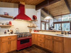
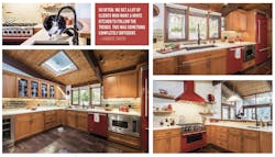
This eclectic red kitchen challenged the remodelers at Baxter Construction to play up the design’s funky factor without making the room look too loud or dated. The project’s lead designer and sales director for Baxter Construction, Candice Smith, mixed textures, sheens, and colors to create a unique showstopper that surprised even their local fabricator. With the bright appliances in San Marzano red and new track lighting on the original wooden beams, Baxter Construction made the otherwise dark room pop. Because of the tongue and groove ceiling that ran through the whole home, recessed lighting was out of the picture. The design team chose unique gold subway tiles for the backsplash and harnessed undercabinet lighting for a glow effect that helped brighten the room. Behind the stove, the team installed another unique backsplash with custom tiles.
There were already some existing wood elements in the house that they wanted to tie into the remodel, so Smith says that they installed live-edge wood slabs for floating shelves and part of the countertop. “We almost went with walnut, but the cherry really spoke to us here,” says Smith. “It doesn’t have an absolute perfectness. It still feels like it’s got a little bit of the forest in it.” To round out the look, the team chose a muted, yet polished, quartz countertop to balance out the other bright colors and textures.
Beyond aesthetics, the team renovated the chaotic, cramped space by incorporating more cabinetry and changing the layout. “We moved the range from the exterior wall where the sink is now to create a focal point.” They also relocated the refrigerator and took down a portion of the old partition wall. The team installed a pantry, cherry cabinetry, built-ins that could house the owner’s cat’s bowls and bronze fixtures. “We knew the bronze would tie into some of the dark brown wood tones that we had, so we thought the finish would be a better choice for fixtures than stainless steel,” Smith says. “We didn’t want to play up stainless steel accents at all.”
Jackson Design & Remodeling
San Diego
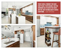
A few times each year, the homeowners of this San Diego abode host a party of more than 100 guests. With that event in mind, Jackson Design & Remodeling set out to make a kitchen that would stand out not only for its aesthetics, but for its functionality. “They wanted it to be easy to move the piano around, so wood floors were out of the question,” says Gabe Sepulveda, senior interior designer for Jackson Design and Remodeling. “We decided to start with warm gray porcelain tiles for the floor.”
Despite the white used for some of the cabinetry and the kitchen island, the overall design is full of mid-century modern complexity: walnut, brushed brass, stainless steel, matte black, muted blues, and glossy acrylic finishes.
Mixing materials isn’t easy, but the team pulled it off by selecting very intentional hardware and finishes for each section of the kitchen and ensuring the entire design remained cohesive. Sepulveda knew he wanted to incorporate brushed brass as a nod to 1950s design, but he didn’t want to do it on the faucets because he worried it might look dated too quickly. He found a better opportunity for the brass finish in some of the cabinetry hardware and lighting fixtures. For the white upper cabinets, Jackson Design & Remodeling avoided using any visible hardware by adding recessed handles and installing a slide-out ventilation hood, with a glass canopy to keep the look streamlined.
Above the oven cabinets, an opening gives guests a peek into the kitchen and shows off the Sputnik chandelier. With 12 Edison bulbs and brushed brass and matte black finishes, the fixture is a centerpiece of the remodeled kitchen. The waterfall kitchen island pulls the room together. The main body borrows materials from the cabinetry while the wall behind the barstools repeats the backsplash’s subway tile pattern, but in white.
Otogawa-Anschel Design + Build
Minneapolis
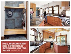
By opening up the space, adding windows, and installing wooden beams to tame the unruly vaulted ceiling, OA Design + Build turned this cramped kitchen into a sunlit entertainment area. The team’s main design goal was to improve the room’s layout and create specific areas for cooking, cleaning, and socializing. In this kitchen, the team played with different stone and cabinet colors to create specific environments in the kitchen, such as the mudroom and the cooking area, that can evoke unique moods and emotions. “I think it creates some desire to return to that space, to explore it and find something new each time,” says Anschel.
Instead of installing a standard rectangular slab for the kitchen island, Anschel says that the team chose to follow the curves and natural dips in the original granite remnants. “Stones don’t come out of the ground in rectangles,” Anschel says. “To me, it’s the curviness of the rock and the weathering by time that makes stone beautiful.” This unusual counter shape isn’t just for aesthetics, however. The softened edges also allow cooks and guests to naturally rest in the counter’s curves and turn toward each other for easy conversing instead of being lined up in a row.
Another interesting detail is the window behind the stove. The team installed glass across nearly the entire wall and encased it the same granite as the countertops. “It’s glass, so it’ll show grease a little bit sooner, but it’s easy to clean,” Anschel says. “It just opens up that kitchen and that stove wall and brings in so much more light.”
The remodel didn’t just evoke feelings of light and nature, however: The renovation itself was sustainable. The cabinets came from a local cabinet maker, the stones came from a local fabricator, and all of the finishes in the kitchen were low or ultra-low VOC.
Annie Cebulski is the associate editor for Pro Remodeler.


