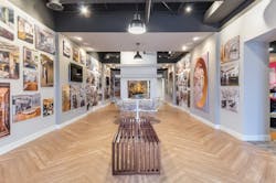
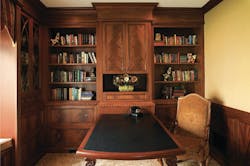
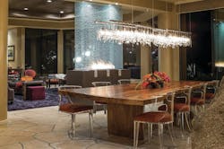
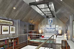
1. Commercial Remodel, Finished Basement Co., St. Louis Park, Minn. | Project location: St. Louis Park, Minn.
With a long history of tenants that includes a funeral home and a pawnshop, the new space for the Finished Basement Co. needed some major renovations to transform it into a modern, functional office and showroom. A one-of-a-kind art gallery was designed at the entrance to give clients a place to see many examples and ideas of previous projects. A theater, bar area, fully functioning modern kitchen, and family room incorporate a variety of finishes from basic to high-end to appeal to a wide range of tastes and styles. The building is all concrete block and floor, which made for some challenges moving pipes and electrical.
The entire interior was demolished, HVAC systems were reworked, and plumbing and sprinklers were brought up to code. The “house” feel of the showroom comes from wood walls built with a steel ceiling to support drywall. The space not only provides an inspiration for future remodels but also acts as a comfortable, relaxing environment for the clients and customers to enjoy.
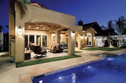
2. Exterior, Marrokal Design & Remodeling, San Diego, Calif. | Project Location: Calif.
A bland yard with grass from end to end was transformed into an outdoor oasis with multiple delineated spaces for entertaining. The owners requested an outdoor family room with fireplace and dining area, a separate guest quarters, a new pool, and a raised sun deck and seating area. For the outdoor family and dining room, wide stucco columns add girth to the structure and provide a look of substance, creating a series of rooms without walls.
Arched openings divide the living spaces from the natural spaces, while a flat roof allows the second-floor bedrooms to maintain a view of the rolling hills beyond the pool area. The pool and the surrounding patios naturally terrace the sloping land. A Jacuzzi is centered on the width of the pool and commands attention with fire accent features. Each separate space has a clear purpose, but they come together to create one usable, family friendly outdoor area.
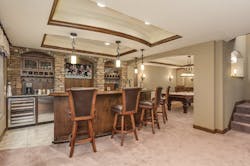
3. Finished Basement, Finished Basement Co., St. Louis Park, Minn. | Project Location: Eden Prairie, Minn.
The homeowners wanted to transform their 1,700-square-foot unfinished basement into a sanctuary that satisfied their family needs as well as their desire to entertain. The existing lower level suffered from low HVAC trunks, several load-bearing interior walls, and a poorly located bathroom. An open floor plan became essential to improve the flow of the basement and integrate each item on the clients’ wish list, which included a family room, game area, large bar, billiards area, bathroom, craft room, and storage space.
The designer incorporated soft curving lines to convert the basic rectangular floor plan into a space that is not only functional but also aesthetically pleasing. Reengineering an existing load-bearing wall created the billiards area, and forging multiple light trays, coves, and other ceiling details hid the low HVAC lines. The redistribution of load points on an angled interior wall produced a straight hallway that leads to the private areas, so now users can access the bathroom, craft room, storage, and utilities easily off the main entertainment space.
The renovated lower level features a mix of warm materials and tones that make the space inviting for everyone. A stacked-stone fireplace serves as the focal point of the family room, and the stone is repeated on arches behind the bar, which showcases custom cabinetry, a curved wood top and arm rail, plus curved wainscoting and crown molding elements. The knotty alder used in the bar appears in the custom oval soffit detail and again in the coffered ceiling in the family room.
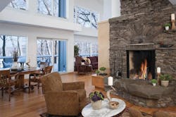
4. Green Remodel, Architectureal Resource, Ann Arbor, Mich. | Project Location: Ann Arbor, Mich.
Southeast Michigan’s first NAHB National Green Building Standard Emerald-certified remodeling project started with an energy audit and solar analysis before any plans took shape. The new home takes in views of the Huron River and has additional square footage, all while reducing both energy use and water consumption by more than half. The introduction of a cross-gabled roof form provides the optimal location for the photovoltaic solar panels and integrates modular sizes for the structural insulated panels.
The new second story space creates an additional recreational area and provides passive cooling. Remotely operated motorized windows to the east are located above a light shelf and act in conjunction with lower, west-facing intake windows. A new master bedroom and bathroom is designed to be ADA-compliant for the future with a removable partial height partition at the toilet area and roll-across shower threshold. A walk-in closet is only five steps from the bed and meets FEMA standards to withstand a 2-by-4 projectile traveling at 200 miles per hour.
A towering oak tree had to be removed to enhance the energy capture of the solar panels, but it subsequently became flooring for the project and unifies both levels. An interactive stairway banister—powered only by gravity—allows the grandchildren to place marbles in the top and watch them travel down a path through iron fish and rockets, adding a whimsical touch to the space.
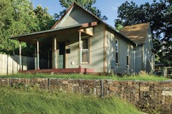
5. Historic Renovation, Silent Rivers Design+Build, Clive, Iowa | Project Location: Des Moines, Iowa
The project had an unexpected beginning but evolved into collaboration among a historic neighborhood association, which wanted to save two small houses that impeded a parking lot, a green redevelopment company owned a nearby lot, and the design-build firm (which navigated the historical process, municipal bodies, and zoning hurdles). The result became an urban rental house with the capacity to teach key tenets of historical rehabilitation and sustainability. The nearby neighborhood association saved a bungalow destined for demolition and relocated the structure to a new site.
Silent Rivers Design+Build converted the 750-square-foot dilapidated house with two bedrooms, one bath, and awkward floors into a fun, upbeat, and livable 1,500-square-foot home to support the revitalization of a traditional working-class neighborhood. The transformation improved the circulation within the house and its capacity (now three bedrooms and two baths), created functional storage where there had been none, and included amenities long disregarded by years of neglect and cheap rent. A product made from recycled plastic bottles and manufacturing waste was used for the subfloor, encapsulating asbestos tiles and helping to reduce shifts in the first-floor framing. Silent Rivers Design+Build diverted old bricks from the landfill and employed them in the construction of a retaining wall along the perimeter of the lot, which supported a storm management system.
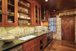
6. Kitchen $50,000 to $100,000, CG&S Design-Build, Austin, Texas | Project Location: Austin, Texas
Located on a hill overlooking the Blanco River, this ranch house has been owned by the same family since 1939. The kitchen underwent a modern transformation in the 1970s, but the renovation hid the space’s natural qualities behind laminated walls and counters as well as outdated cabinetry. Now the family sought to modernize the kitchen once again and bring back the old aesthetic with a contemporary twist.
Because of its existing layout, the kitchen proved to be small and cramped. A refrigerator jutted out into the space and restricted flow, and counters in front of the windows limited the amount of natural light. In addition to problems with functionality, the finishes were outdated. The laminate of the kitchen counters extended up the wall, concealing the original stone wall, and worn vinyl covered the floors.
For the new design, CG&S Design-Build removed the antiquated cabinets, revealing the perfectly preserved native stone wall. Backless cabinets and shelves were attached directly to the wall so the stone remained visible. Workers relocated a cast iron sink further down the counter and replaced the old range with a new cook top and oven plus a vent hood. Granite counters, schoolhouse pendants, recessed lighting, and walnut floors complete the revitalization.
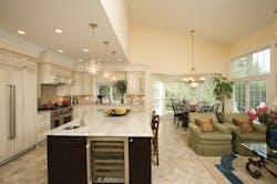
7. Kitchen Over $100,000, Michael Nash Design Build & Homes, Fairfax, Va. | Project Location: McLean, Va.
A family of five wanted to renovate and upgrade their 20-year-old kitchen, which suffered from a bleached look and had a layout that hindered fluid movement throughout the space. The existing bulkheads contained all of the plumbing and ductwork, but all of it would have to be removed in order to take advantage of the room’s height. Moreover, the kitchen sat above a very tight crawlspace area that made access to both gas and plumbing lines very challenging. As a result, an adjacent family room needed to become part of the plan and facilitate the oval design of kitchen cabinetry.
The client sought to give the new kitchen a French country look by carrying over the soft and creamy color scheme of the main-floor furniture. Michael Nash Design Build & Homes pulled out a cook top from the island and installed a 48-inch professional range under a custom wood hood along the back wall of the kitchen. A tower-style refrigerator covered in matching wood panels sits near the end of the run, creating more workspace on both sides of the stove. Michael Nash Design Build & Homes ran an extra plumbing line for the prep sink in the large new island, which features a dark chocolate finish and also includes a second dishwasher, a beverage center, and a built-in microwave.
One of the project goals focused on making sure all of the walls surrounding the kitchen became involved with the remodel. Lower cabinetry and upper display cabinetry fills the main wall of the kitchen, and new cabinetry in the butler area just off the space establishes harmony.
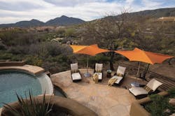
8. Outdoor Living Over $100,000, Pure Design Environments, Eden Praire, Minn. | Project Location: Scottsdale, Ariz.
Seeing its potential as a luxury second home, the client purchased an abandoned house in the Arizona desert mountain area. The once-developed landscape, which had been left to grow wild and die in the hot sun, required a great deal of attention to restore beauty and do justice to the home’s recently renovated interior and exterior. The client requested a babbling brook, multiple seating areas to accommodate relaxation as well as entertainment, an outdoor kitchen, and green space for a small dog.
Pure Design Environments first recognized an irrigation problem—when water fell from the roof there was no place for it to run off naturally, so the water would ultimately pool around the house. Diverting the water into a dried-up creek bed overcame the irrigation obstacle and also fulfilled the client’s desire for a babbling brook. To incorporate a seating area near the babbling brook, Pure Design Environments utilized a bridge and stair system that adds a layer of texture and height contrast. The home came with a pool, but a 5-foot drop from one section of the patio presented a safety hazard. A high-bar seating area acts as a barrier from falling and also maximizes views of the city and surrounding mountains.
Pure Design Environments implemented additional seating in the areas that receive the most shade and installed artificial turf near the house as a safe alternative to perimeter grass. As a result, the client can now enjoy all-season outdoor living in a desert location.
9. Residential Interior Under $100,000, Sullivan Building & Design Group, Quakertown, Pa. | Project Location: Jamison, Pa.
The client spends quite a bit of time in the home office, which is located just off the living room. The space affords a great view of the backyard but lacked any character, so the homeowner wanted to give the room a feeling of an estate library but with the amenities of a modern home office. The room proved to be limited in size, but Sullivan Building & Design Group incorporated creative design solutions, especially when adding storage to two of the walls and planning for a desk that requires seating from both sides.
The existing home office suffered from conventional, white-painted walls, and a dull beige carpet. Fluted pilasters, heavy crown moulding, and a carved chair rail now distinguish the figured mahogany office. A large cabinet above the desk serves as the highlight of the space with broad, bookmatched mahogany doors, and a display nook. Upper bookshelves and lower file drawers flank the center cabinet and the desk, which is inlaid with a honed granite top. A built-in seat next to a large bay window offers views of the backyard and also offers shallow storage underneath.
As a result of the transformation, an uninspiring home office with plain walls and ordinary flooring became an estate-feeling library clad in figured mahogany textured silk wallpaper, and delicately patterned carpet.
10. Residential Specialty, Pure Design Environments, Eden Praire, Minn. | Project Location: Scottsdale, Ariz.
As part of a whole-house remodel, the built-in divider wall provides aesthetic pleasure to the eye but fulfills many functions. It primarily separates spaces within the home’s open floor plan without constricting areas and defines the specific use of each room. Typical entertainment centers or television cabinetry traditionally lack appealing design qualities and serve no other functional purpose, but the built-in divider wall has become the statement piece of the house. A hydraulic lift allows the client to tuck away the TV when not in use, and a fireplace on the other side affords the ability to offer dinner guests an added level of ambiance when hosting.
The cabinetry conceals the heavy hydraulic lift, which raises and lowers a 60-inch TV. Usually entertainment centers have a defined front and back, but the built-in divider wall has two fronts, so Pure Design Environments worked with a custom cabinet fabricator to make sure the unit came out both sturdy and beautiful. Because the side opposite of the TV houses a fireplace, the materials selected for construction had to be heat resistant and fire safe. Pure Design Environments also incorporated a central exhaust fan that perpetuates air flow through the unit and keeps the electronic lift and fireplace from overheating. The multifunctional centerpiece continues to please the client, who appreciates the entertainment solution and its ability to preserve the home’s desert mountain views.
11. Whole House Under $300,000, Euro Design | Build | Remodel, Richardson, Texas | Project Location: Sandy Shores, Texas
Originally built by a commercial contractor, the home demonstrated a lofty intention to create something spectacular. The house is located a lot in an aviation community and remains tucked back near a lake surrounded by the beauty of natural elements. But the materials used in the original construction proved to be inappropriate for the structure, and the subcontractors cut corners in every direction. Poor planning of space, a lack of basic design elements, improper electrical wiring, and other structural defects made the home less than desirable. The main focus of the project centered on undoing previous mistakes and rebuilding the house to the current owner’s ideals and contemporary style.
The original contractor finished the exterior with slate tiles, but he failed to implement a moisture barrier and, as a result, water leaked through the wall in multiple places. Euro Design|Build|Remodel carefully removed and reinstalled all of the slate tiles only after applying a waterproof solution. Because the sitting area inside the master bedroom was added after the home was built, the chimney continued to leak into this space and thus required a complete teardown and rebuild. A new custom metal-and-glass pivot door entrance offers a clear view of visitors from inside while providing an elegance the house needed.
