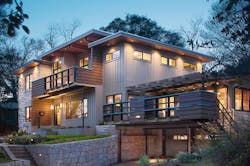
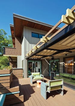
Builder Royce Flournoy and architect Jed Duhon had never worked together before, but when they mapped out the renovation of Duhon’s home in Austin, Texas, all the pieces fell into place. Built in 1951, the original two-bedroom, one-bath house had been remodeled several times by different owners. Duhon and his partner Michael Harper, required more living space for their children, ages 4 and 6. They also wanted the home to fit in with the neighboring mid-century modern houses.
A steep slope in the backyard ruled out a first-floor addition. Instead, Duhon and Harper decided to add a second story that includes a master suite, guest bedroom, home office, and a full bath. The new upper level added 1,300 square feet to the 2,550-square-foot house.
Second Floor & More
Prior to adding the second floor, the clients had built a deck on the front of the house, created a master suite, and done a light kitchen remodel. They also installed extensive terracing and retaining walls in the front and back to provide play areas for the children and space for a koi pond. “It’s not very accessible for tractors,” says Duhon. “Plus, we had invested all that money in the landscaping and didn’t want to destroy it. So going up seemed to be the best option.”
After looking at several builders, the couple hired Austin-based Texas Construction Co. “We liked [Flournoy’s] business model,” Duhon says.
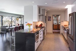
The architect, who is a senior associate at Steinbomer, Bramwell & Vrazel Architects in Austin, drew the second-floor plan to fit within the existing footprint of the house, taking into account the intricate jogs and variations of the existing exterior walls. The first-floor plan did not change dramatically, though Duhon opened up walls between the dining room and kitchen, and also opened up the kitchen in several directions “so it’s better for entertaining. We now have a little peninsula with seating for guests. They can also stand on the outside perimeter while someone’s working in the kitchen and not get in the way.” The existing master suite became the children’s playroom.
Duhon had to fit in the new rooms while determining the best location for the staircase and avoiding hallways and other wasted space. The addition covers about 80 percent of the main floor.
The interior required a substantial amount of updating, particularly the lighting. “There was no downlighting or directional lighting, and we had a lot of artwork we wanted to [illuminate].” The outdated finishes, single-pane windows, and old electrical wiring had to go. Another issue that had to be addressed was the home’s lack of insulation.
“The energy bills were horrible,” Duhon says. “You could stand next to the windows and feel the air coming in from outside.” At the time of contract signing, it was agreed that very little would be done with the living room and kitchen. But during the course of construction, the clients added those two pieces back in, Flournoy says, along with 6 kilowatts of solar roof panels.
Growing Pains
As is typically the case with remodels, a good set of drawings doesn’t tell the whole story once demolition begins.
“In plan view, when you get the project initially, it’s easy to theorize about what you’re going to do to make that occur, but it’s not until you do your initial demolition and expose all the framing that you can really figure it out,” says Flournoy. “Right after you do your demo you have to re-evaluate how you’re going to construct the project from an engineering standpoint and a framing standpoint. It gets a little bit difficult from a cost perspective as well as an execution and timeline perspective.”
Flournoy and his crew discovered that the existing foundation could not support the load of the new floor. Several piers were cracked. Additional piers were set and perimeter beams added underneath the house.
“Also, the crawl space was really tight and there were things we couldn’t get to until we started ripping up the floor and creating several different access points,” he says.
The staircase, became “a project within a project.” Because of its location (a former closet), space was very tight—so tight that the framing had to be mocked up in the field to ensure it met building codes as well as the desired design aesthetic.
“We had a rise-and-run issue between the two floors, as well as some issues with the existing first-floor plan,” Flournoy says. Ultimately, the trim carpenter was assigned to do the framing and trimwork.
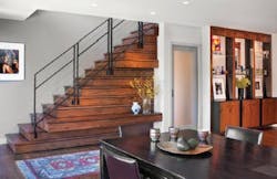
The red-oak stairs complement the home’s existing red-oak flooring. “You can see the stair from the dining room, so I wanted to make it more interesting,” Duhon says. “I created a bench there where the kids can put on their shoes, and a couple of display shelves.”
Reclaim & Conserve
The builder and architect employed a variety of techniques to improve the home’s energy performance. Wall cavities were filled with spray foam insulation, and the home was wrapped in a liquid-applied air barrier that is typically used in commercial construction. A light-colored reflective material was used for the flat roof, and double-glazed, low-E windows were installed. Other features include low-VOC paints, an energy-efficient HVAC system, and a rainwater collection system.
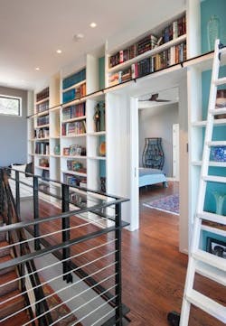
LED lighting throughout the house also saves energy and illuminates details, such as the stair rail, Flournoy says. “The lights are recessed cans that have no trim, so they’re floated in,” he says. “They really are sleek.”
Duhon recycled many of the home’s original exterior materials, including the redwood siding, the stone masonry, and some of the board-and-batten siding. Where necessary, the builder matched the existing limestone with new material.
“Because of the way we’re set up above the street, we didn’t want the mass to be too overwhelming,” Duhon says. “I used the first- and second-floor decks to break up the void and soften the elevation.”
When the old carpeting in the children’s bedroom was pulled up, Duhon found wood flooring underneath, and decided to salvage and refinish it. Several fireplaces were kept as well. While the remodel was going on, Duhon and Harper took the opportunity to modernize the interior finishes, achieving an Asian-inspired look with simple, clean lines.
“The bathrooms came out particularly well,” says Flournoy. “Jed paid a lot of attention to the materials and the layout of the tile. I know he labored over the color palette and I think it’s a kind of masculine house, which is what they were going for.”
The kitchen appliances remained in the same locations, though the sink and the countertops are new. Approximately half of the cabinets are new, chosen to match the existing ones, which were repainted.
Kitchen finishes, such as large-format gray porcelain tile flooring, were deliberately chosen to hide dirt (a must in a home with small children). The countertop surfaces are made of lava rock from Italy that is highly resistant to temperature extremes and damage.
Friendly Relations
Having a client who is also an architect sounds like it could be a recipe for disaster, but in this case, the positives far outweighed the negatives.
“I admit that building for an architect is probably a pain for the contractor,” Duhon says. “I paid attention to all the stuff that the typical homeowner would not know to look for, such as air barriers and waterproofing and roof details and the flashing around the windows. But the crew worked with me, and I appreciate it.”
He also visited the site every day. “I don’t think the contractor and the project manager liked that, but they got used to it,” he says, laughing. “We figured out a system, and it got to the point where they just expected me to be there and had a list of questions for me every morning.”
Flournoy was impressed by the professionalism and skill that Duhon brought to the table: “He did a great job creating a secondstory addition in which the existing character of the house remained. And when we needed a decision about something, it was real quick because [the client was already] there. He was very open to whatever was available and what made sense.”
Duhon adds, “It’s a very well-built house. I know it will last for a long time. That was one of my goals—not just to make it energy efficient but for it to be there for future homeowners to enjoy.” PR
Product List
Appliances: Viking
Lighting control system: Lutron
Lighting fixtures: Tech Lighting
Siding: James Hardie
Skylights: Velux
Windows and doors: Fleetwood
