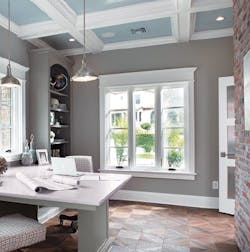
Show homes are over the top by design. They push the limits of what most builders or remodelers will undertake because the home needs to be big and bold enough to offer something to every visitor.
This article discusses lessons from the home’s architecture, interior design, and engineering. Follow-up feature articles in February and March will detail exterior and interior products.
Work with the lot
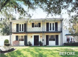
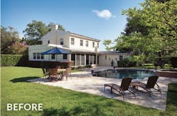
In this project, Orlando remodeler Farina & Sons removed some poorly done additions from the 80-year-old Mediterranean Renaissance-style structure, while retaining its two-story historical core. They also built expansive new additions: a big sunroom, or gallery, that spans the back of the original home, connecting it to a luxurious master suite with an office on one side and an open-plan family room/kitchen on the other. The family room adjoins an attached garage (25 percent larger than pre-renovation) and a backyard living area with a screened pavilion, pool, and outdoor kitchen.
The lot has a 6-foot elevation difference from one end to the other. The garage is at the low end, and the floor plan steps down to it, allowing the home to hug the landscape and eliminating the need for a steep driveway. The only second-story addition—a bonus room over the garage—was also located at the low end, where its roofline wouldn’t compete with the core structure. “We didn’t want the additions to look too tall,” Farina says.
Terracing the front yard also helps the home fit into the landscape. Before the remodel, the front yard had sloped up to the house from a single retaining wall. Farina and landscape architect Scott Redmon, principal and lead designer at Orlando-based Redmon Design Co., replaced that with concrete and stone walls that step up and down the lot in increments.
Know what to keep
Another problem was how to modernize the older section of the home without sacrificing its original charm. Part of the answer lay in keeping a few signature elements of the core structure. These included the iron posts and railings at the front of the house, the low interior ceilings, and the original fireplace surround. “It feels like a 1930s house when you walk in the front door,” Nasrallah says.
Another signature element was structural. The original home was built with solid masonry blocks—popular in Central Florida during the ’30s but rare today because of cost. Despite the added expense, the architect, contractor, and homeowner all agreed to use them on the additions’ gables to create a period feel.
Blend carefully
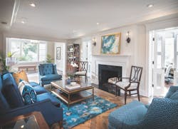
The design of the new additions is transitional—a blend of traditional and modern that’s neither too formal nor too stark. Interior designer Grant Gribble, FASID, president of Gribble Interior Group, in Orlando, lavished attention on details that would unify the additions’ rooms with one another and with the original home.
The wood trim is elegant but emphasizes clean lines. “Rather than fancy crown with dentils, we opted for simple crown,” Gribble says. The moldings look at home in the 1930s structure but also fit with the more modern additions.
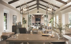
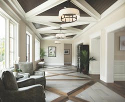
Floor materials play a unifying role, as well. “Grant did an amazing job designing interesting floors and ceilings that link adjacent spaces,” says Caron Farina, who heads advertising and marketing for Farina & Sons. In the gallery, for instance, craftsmen skillfully wove together the reclaimed hardwood from the existing home and master suite with the tile used in the kitchen and family room.
Look up
Although ceilings can easily be an afterthought, a carefully conceived ceiling can define a room. In fact, the ceilings in this project got as much attention as the rest of the house, especially in the common areas.
For instance, there was a lot of discussion about the original home’s low ceilings. “We considered raising them, but that would have been a structural nightmare,” Nasrallah says. In the end, he decided that keeping them would create separation between the old and new wings. “Walking through the low-ceiling [areas] in the old part of the house accentuates the drama of the gallery’s high ceilings,” he notes.
In the gallery, the cross-pattern faux ceiling beams directly mirror the floor’s woven tile-and-wood pattern. And a common vaulted ceiling design in the family room and pavilion create a visual flow between indoor and outdoor areas.
Gribble cautions against making vaulted ceilings too high and insisted on making the family room ceiling lower than the trusses in order to make the room feel more comfortable.
Repeat creatively
Floors and ceilings aren’t the only unifying elements. Nasrallah and Gribble repeated form and shape throughout. For example:
- The circular molding patterns in the old dining room ceiling and chandelier echo the moldings on the front door and the circular front windows.
- Visual elements in the master bedroom’s custom-made stained-glass window match those of the light fixtures.
- The master bath’s ceiling recess repeats the octagonal pattern in the plumbing fixture base plates.
- The steel French doors on the pantry match those in the gallery.
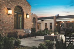
- Recesses in the outdoor pavilion’s brick columns continue a theme used on the rest of the home’s brickwork.
The effect of these touches is subconscious. Most don’t attract attention, but they all help to subtly knit the home’s disparate spaces into a coherent whole.
Guide the eye
Sight lines through the home’s public areas reinforce the sense of flow between them, with a view down the length of the gallery and through a mudroom to the garage intersecting another one through the family room/kitchen to the outdoor pavilion. “The long views highlight symmetry between spaces,” Gribble says.
Outside, a view along the back of the house also ends in strong visuals. Workers replaced an old pool on one end of the property with a fire pit and built a new pool and hot tub with a “green wall” at the other end. Although the outdoor pavilion separates the two zones, a straight line of sight runs from the pool through the pavilion to the fire pit.
Quantify energy goals
The efficiency goal chosen for this project was ambitious: qualify for the highest Emerald rating from the National Green Building Standard (NGBS).
NGBS ratings are based on the Residential Energy Services Network’s Home Energy Rating System (HERS) Index, which compares actual energy use to a hypothetical reference home of equal size and shape built to current energy code. HERS is a point scheme, with every point denoting a 1 percent rise or fall in energy use. The lower the score, the better: A home that uses the same amount of energy as the reference earns a rating of 100, while a home that scores zero generates as much energy as it consumes, typically via solar electric panels.
Hitting the target wasn’t easy. For instance, Smith modeled various ways to insulate the existing structure’s solid brick walls, eventually settling on a layer of unfaced ¾-inch extruded polystyrene (XPS), followed by ¾-inch furring strips and a reflective foil insulation. Air trapped in the cavity between the foil and the insulation board added the additional R-4 needed by HERS. Farina also replaced the old, leaky windows with new low-E models and used energy-saving LED lights throughout.
With humidity an issue in Florida, Smith chose to insulate the first floor joist cavities with closed-cell foam to prevent crawlspace moisture from migrating into the house. Unfortunately, the crawlspace was just 18 inches high. “We had to do some digging to make room for workers and their equipment,” he recalls. While they were in there, the crew also laid a plastic vapor barrier over the soil.
To further guarantee an efficient, dry interior, the house has two high-SEER air conditioning units that positively pressurize the home. And the walls will not include a vapor barrier (hence the unfaced XPS). “We want moisture to be able to dry to the outside,” Smith says.
Build bandwidth
As more young people enter the remodeling market, demand for electronic home technologies will only grow, so one project goal was to show remodelers what’s possible. The home is completely automated: The security system, lights, door locks, window blinds, and HVAC system can all be controlled from in-house touch screens or with a smartphone or tablet app.
Despite the ubiquity of wireless devices, Tracy Adcock, owner of Orlando-based HSS Custom AV, the electronics integrator, says that a large home like this absolutely needs data wiring. One reason is so that TVs can better handle those bandwidth-hungry video services. Another is that the home is simply too big for one router, so wiring must carry the signal to wireless access points that boost the Wi-Fi signal in various parts of the house.
Another thing that hasn’t changed is that data wiring must be installed in home runs from each of these points back to the rack. Daisy chaining isn’t allowed, as each connection lowers the cable’s bandwidth capacity.
Manage for success
Remodeling is a collaborative undertaking, and it’s not news to anyone that having a team that can work together is a big advantage. However, it’s particularly crucial for a big, complex project like this. That’s why Farina, like all successful remodelers, creates long-term relationships with great subs. “You’re only as good as you hire,” Farina notes, adding that most of his subs have been with him for years, if not decades. “I’ve known the roofer since the mid-’80s. The electrician and plumber went to school with me. After a while, they’re like family.”
Having a dedicated team really pays off when the project encounters an unexpected road block, as did the New American Remodel when Hurricane Irma blew through Orlando on September 11. Fortunately, the project sustained no hurricane-related damage, thanks in part to crews working extra hours before the storm, clearing the site of items that could be blown about by the wind, boarding up large openings, and moving stacks of wood trim inside.
Heavy rain during the previous weeks had already put the exterior brick and stucco behind schedule. While those crews were able to get back to work as soon as power came on, things were tougher for other players.
The Orlando building department was overwhelmed in the weeks after the storm, which meant longer-than-usual waits for inspections. Some material shipments were also held up. The landscaper had ordered plants from a supplier in South Florida that was hit pretty hard by the storm, so there was a delay in getting the landscaping done.
In the end, however, everyone chipped in by working overtime for weeks to make sure the home was ready for the International Builders’ Show in January.
The result of all this effort and coordination is a home bursting with practical design ideas and cutting-edge products that will benefit any remodeler. If you’re at the show, it’s worth checking it out.
About the Author
Charlie Wardell
Charlie Wardell is a freelance writer and former remodeler in Tisbury, Mass.
