A Vision for Modern Life
“One big lesson is that you have to be nimble,” he says, because circumstances can throw a wrench into the machinery of your expectations. “The other is that properties with the biggest challenges often present the most opportunity.”
This property had been passed over by other investors, who called it a gamble. It was a 1950s ranch with 2300 sq. ft. of living space, asbestos siding, and leaky steel windows—so they were right. The lot was also a junkyard, with scattered piles of concrete blocks, pallets, and old railroad ties, accompanied by an actual caboose. Then there was the giant hole that needed to be filled. And to complicate things further, soon after crews removed the old roof a strong wind tumbled several exterior walls. That was all just to start things off.
The finished home is clean, modern, and spacious, with 5,800 sq. ft. of conditioned space and another 3000 sq. ft. of outdoor living area. The lot is now well manicured with a carefully planned orchard and vegetable garden.
Visitors passing through the front door are greeted by a brightly lit interior with custom artwork and overhead fixtures commissioned specifically for this home.
Earthy Modern
When the discussion turns to architecture, Gardner focuses on how the home’s features address the way he believes people want to live. “People are stressed out and seeking comfort,” he says. He wanted to give builders and remodelers ideas on how to provide that comfort.
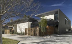
From the street, the house looks smaller than it really is. That first impression comes from the multiple horizontal lines, including a low front roof, as well as the tapered soffits that make the home’s thick roof cavities seem less massive. In addition, the front door is recessed into a deep nook that hides it from the street.
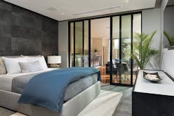
The material choices depart from most modern architecture. Earth tones dominate here. Rough stone veneer covers the wall at the front of the property and much of the home’s front facade, which also incorporates stained wood siding and dark metal roofing. Two small bedrooms on either side of the front door have sliding glass doors, but the doors are hidden from view by screening fences made from the old railroad ties from the yard.
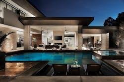
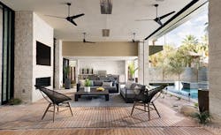
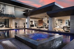
Gardner calls the home “inward looking.” The floor plan is that of a courtyard home—an outdoor living room and pool form an inner sanctum and most of the home’s other rooms face towards it. Someone in the outdoor living room can interact with people in most other parts of the house. The courtyard layout also provides shade in summer and protection from cold winter winds. There’s a small room opposite the outdoor living room next to the pool that has been furnished as an additional secondary gathering space. However, it has its own bath and could be reconfigured as a guest suite.
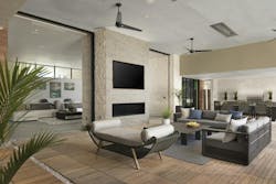
The organic theme continues inside the home, with the same stone and wood siding used as wall surfaces in the living room. Floor and wall tiles are earth-toned, while cabinetry and woodwork have been finished with deep stains.
Going through the front door, you understand what Gardner has done: made a cold architectural form feel warm.
Looking Inward
The home is designed to unfold visually as you walk through it. The floor plan wraps around a central courtyard, with a covered outdoor living area and a swimming pool. Architecturally, this is about as traditional as it gets: courtyard homes date back 8,000 years.
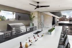
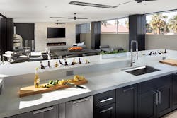
The first-floor living room, kitchen, utility room, and small “casita,” or guest room, all face the pool and outdoor living area. The second floor—a luxurious master suite and outdoor kitchen—overlook them. Someone in the outdoor area on the first floor can hold a conversation with someone in most other parts of the house. And if friends with kids are visiting, the adults can be in the upstairs or downstairs outdoor spaces while watching the kids at the pool.
The home’s wings also shield this inner sanctum from the hot summer sun as well as from cold winter winds. The pool even acts as an evaporative cooler, helping lower temperatures in those spaces.
Modern Living
But while the home incorporates plenty of traditional elements, it’s ultimately meant to support modern lifestyles, with entertaining being a big part of the theme. There are 11 large screen TVs and five gas fireplaces, where people can “chill.” There’s also an alarm system, and a home automation system with touch screen panels, whole-house audio, and lighting control.
Next to the kitchen there’s a butler’s pantry with another grill, a pizza oven and a built-in coffee system. Caterers can be working here while the cook entertains guests.
Main living areas are separated by large glass wall panel sliding systems that allow already open rooms to be extended even further for entertaining large groups.
The entry from the garage to the kitchen is through an upscale mud room/laundry room and a well-appointed butler’s pantry. This is where the caterers will work during dinner parties.
The pantry even has an urban cultivator for growing herbs. The home was designed to aid what Gardner calls the farm-to-table lifestyle, which is why he included the backyard garden with vegetables and fruit trees. We’ll explore the farm-to-table theme, along with the home’s other “green” features, in the March issue.
Of course, few homes will have all these features. But as with any show home, the intent is to offer a menu of products and design ideas that builders and remodelers can choose from. There are certainly plenty of them in this house.
If you plan on attending this year’s International Builders’ Show, The New American Remodel is worth a visit.
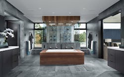
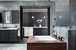
Amenities in the master bath include a deep soaking tub, an electronic shower and two high-tech toilets, each in its own private stall.
The 2019 New American Remodel Team
Left to right:
Tucker BernardElma Gardner
Interior Designer, By Design
Michael Gardner
Remodeler and Architect,
studio g ARCHITECTURE
Jamahl Gibbons
Manager of IBS Show Homes, NAHB
Judy Brociek
Director of Events, SGC Horizon
