The 2021 New American Remodel
Situated on the Western shore of 143-acre Lake Sue in Northeastern Orlando, this year’s New American Remodel was always a structure the locals talked about. Built in the early 1970’s, it was a real oddball with five discrete half-levels, vertical board siding, and protruding balconies. Passersby may have thought the architect was spatially dyslexic, or stoned.
What Rob Smith of E2 Homes, this year’s project’s remodeler, saw was a playful design with lots of possibilities. It reminded him of a treehouse. He called it “Lake Shore Levels.”
While both Smith and the homeowners agreed that the house was overdue for an update, they didn’t want to lose that playfulness. They devised a plan to eliminate the cluttered quirkiness without losing the five half-levels. Their goal was for the finished project to remain a neighborhood conversation piece, but for the tone of those conversations to be one of admiration.
Explore the New American Remodel here.
What Style is This? A little known one, Sarasota Modern
The finished product is a testament to the plan’s success, but the photos don’t really do justice to how much head scratching went into the transformation. What do you do with such a structure?
“We knew it had the potential of being a great house,” recalls Rob Turner of CRT Studio, the interior designer. “But we also knewFortunately, a trained eye like Turner’s can see hidden qualities that others miss. After analyzing the front elevation, Turner realized that the home had all the basic elements of Sarasota Modern, or The Sarasota School of Architecture.
The style was popularized in central west Florida between the 1940s and ‘60s. Like this home, Sarasota Modern structures were characterized by large windows, doors shaded by deep overhangs, and rooms arranged to funnel breezes through the interior. “We wanted to keep those elements,” says Turner. “We just needed to give the home some pizazz.”
Pizazz in this case turned out to come via a simple, Modern facade. It’s defined by long, horizontal lines and large glass doors that offer views to the lake from much of the interior.
AlthouAnd the clutter? It’s gone. It has been replaced by a simple yet bold example of Mid-century Modern architecture. The new facade also clearly defines the interior spaces, with every cube or protruding volume outlining a room. Here, the recessed, dark stucco volume on the far left encloses the formal living room at the top and the entry foyer below. The long horizontal space above the garages defines the kitchen and family room. The boxes on the top floor are the guest suite and master suite.
Creative interiors make the New American Remodel
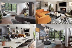
The remodeled home’s beauty goes well below the surface. Lakeshore Levels’ interior transformation has been as dramatic as its public facelift.
As any remodeler who has updated a half-century old home knows, partUnfortunately, structural constraints made it impossible to raise many of those low ceilings. Fortunately, the design and construction team thought their way around the issue and were able to create vertical volumes in certain areas. They arranged the spaces so that ceiling details and indirect lighting changed size and shape depending on room size and function. They also used large expanses of glass to bring the outside in and make the home feel bigger.
The low-ceiling kitchen, for instance, opens to a voluminous great room as well as to a small but high-ceiling sitting room. Large doors and windows fill the kitchen with natural light while providing for a not-too-shabby view of the lake. The team repeated this pattern in different areas. In doing so, they were able to complement large rooms with cozy nooks that offer a measure of privacy without feeling cramped. The end result is an environment that’s conducive to entertaining, while also being a warm and comfortable family home. The sitting room has the home’s tallest ceiling along with a dark wall and eye-catching art. It’s an example of how finishes and wall treatments can define the flow throughout the home.
We knew it would take some creativity to unlock its underlying beauty.
Another interior challenge the team faced was how to create transitions between those five half-levels in a way that made the house feel less choppy. They found their solution in a central stairwell that ties the levels together more coherently than before. “The original house was like a maze, with little staircases here and there,” says Turner. It’s a hallmark of Sarasota Modern. “Now, the central stair volume connects everything.”
You can actually see a reflection of the interior transformation from the outside, if you know what to look for. The old home called attention to its public face without revealing much of what was inside—a boxy mystery. By contrast, the remodeled home’s facade is arranged to mirror the rooms behind it. So wherever you see a cube or protruding volume, what you’re seeing is the definition of an actual space. “I call it a truthful design,” says Turner.
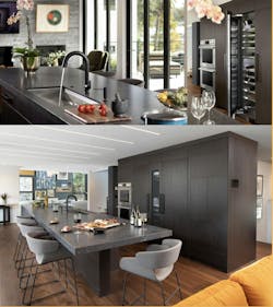
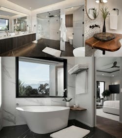
The kitchen has a simple design, making it functional and convenient. The island includes a sink, a dishwasher and a cooktop with downdraft ventilation. The appliance wall houses an oven, a wine refrigerator and refrigerator-freezer columns with cabinet fronts. The dark, monochromatic cabinets reinforce the home’sThe main focus in the luxurious master bedroom is the lake, as shown by the folding glass door and balcony. Inside the room, a sided recessed wall divides the space, with a dressing area on one side and bed on the other. The includes a backlit floating ceiling. The master bath provides a high-end spa-like experience. The electronically controlled shower includes body sprays, fixed and handheld showerheads, a steam function and audio speakers. The freestanding tub is next to a window with a view. The porcelain tile was selected to replicate the finest marbles while organic wood details add material diversity.
Public and private spaces updated for modern living
Outdoor living spaces have long been a staple of The New American Remodel, and of American homes in general. In Florida’s climate, they are basically a must. The point is clear at Lakeshore Levels, which has outdoor living spaces at the front and back.
Across the road from the front of the home—a road most trafficked by pedestrians and bicycles—a boat dock includes a sitting area and a row of stainless steel cabinets. It can serve as an overflow space during parties while providing opportunities for impromptu connections with neighbors out for a walk.
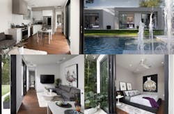
The back of the house is less public. This is a secluded, private retreat with an outdoor kitchen under a lanai and an artificial turf play area. There’s also a pool and a patio that, when the project is fully completed, will be covered by a large pergola with adjustable louvers that can be closed when needed to keep out sun and rain. The covered outdoor kitchen is a place to have a meal while enjoying fresh air and shade. There’s a beverage fridge, an ice chest, a sink and two large-screen TVs. The gas grille has zones for smoking and grilling. Retractable insect screens can enclose the space or roll up into the ceiling. The structure in the background is one end of the Cabana.
The Cabana is a shotgun house, which is to say it’s long and narrow with four stacked rooms—bedroom, kitchen/family room, yoga room, and office—and two small baths. Possible uses include a guest house, an owner’s retreat, or a home office. The structure has a Modern design with large glass doors that mimic those at the front of the main house. It even has views to water, in this case the pool.
The bottom line is that Smith, Turner, and the rest of the E2 team have succeeded in creating a luxurious lakeside retreat that offers what Turner describes as “a clean focused approach to modern living” while also retaining the best parts of the original home. That’s what skilled design/builders do.
