The warm and earthy shades of 2021 Colors of the Year tell a story of comfort mixed with a yearning for something new.
Whites and grays will remain popular, but without a pop of color or compelling design, an all-white or gray kitchen can feel overdone. One of the colors included in PPG’s 2021 palette is actually described as the “antidote to an era of grays.” And though grays do make an appearance in some of the palettes for 2021, a majority of the shades vere toward warm, natural tones or accent colors that could easily pair with browns, beiges, and off-whites.
Warm, organic tones are trending for interior and exterior projects
“Gray is such a popular color choice for home interiors already, a color homeowners want,” Michelle Lamb, founder of Better Home Texas says. “But they are always commenting that they want to still have a cheery room despite the gray.”
Mary Miksch, team leader and designer at Neil Kelly, predicts that there will be more blues and greens thrown into the mix. She says that “there is a general trend toward warmer colors with bold pops,” as homeowners spend more time in their home and realize they want to make their home more personal.
This desire for something new is not just hearsay. Designers indicate a return to warmer, organic shades. In the National Kitchen & Bath Association’s Design Trends Report, contemporary and transitional styles may have ranked the two top styles expected in the next three years, but a natural/organic style comes in at a close third, beating out modern farmhouse and mid-century modern. The Color of the Year options are falling in line with those predictions, but with some twists.
Here are 7 Color of the Year shades from some of the largest color experts in the industry:
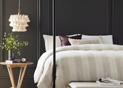
Sherwin-Williams: Urbane Bronze
“The trend for biophilia continues to shape our spaces, proving that nature is never far away. Urbane Bronze might be a color rooted in nature, but it also has a unique ability to ground a room through organic appeal,” the company says. Sherwin Williams recommends using it as accent window trims or walls to add a relaxing, natural touch. When paired with other biophilic elements such as plants or reclaimed wood, Urbane Bronze enhances the cozy, serene atmosphere. “The home is now the ultimate retreat from the world, and color is an easy and effective way to create a personal haven,” says Sue Wadden, director of color marketing at Sherwin-Williams. “Urbane Bronze encourages you to create a sanctuary space for mindful reflection and renewal.”
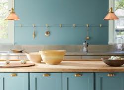
Benjamin Moore: Aegean Teal
Although still rooted in an organic theme, Benjamin Moore’s Color of the Year, Aegean Teal, stands out from other shades selected for 2021 with its bold, saturated hue. When paired with the rest of the 2021 palette, however, it is clear that together the colors create an earthy, warm look. “Amid uncertainty, people yearn for stability. The colors we surround ourselves with can have a powerful impact on our emotions and wellbeing,” says Andrea Magno, Benjamin Moore Director of Color Marketing & Development. “Aegean Teal and the corresponding Color Trends 2021 palette express a welcoming, lived-in quality that celebrates the connections and real moments that take place within the home.”
PPG: “Natural and Serene” 2021 Palette of the Year
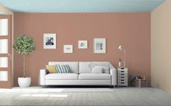
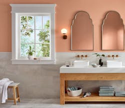
For the first time, PPG selected a palette instead of single shade. Included in PPG’s 2021 Palette of the Year are the colors Transcend (a midtone oatmeal hue), Misty Aqua (a muted cerulean blue), and Big Cypress (a shady ginger). “Paint colors intended for the person who wants to fully embrace mindfulness and intention, our first-ever Paint Color Palette of the Year showcases natural hues that are comforting, compassionate and optimistic,” the company says. “The color trio celebrates beauty of all kinds and relates to those who prioritize wellness in mind, body and spirit.” With descriptions of the hues like “a big, comforting hug for your home” (Big Cypress) and "feeling of a warm latte on a cool morning” (Transcend), it’s clear the palette is intended to add calming colors to a home like an herbal tea steeping in hot water.
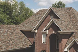
Owens Corning Shingle Color of the Year: Aged Iron
It’s not just the paint companies that jump into the Color of the Year predictions. Owens Corning has dubbed Aged Iron as the shingle color of the year. “2020 has forced us to find sanctuary in our homes, but it has also allowed us to rediscover the wonder and beauty of nature, because it’s a safe space,” says Sue Burkett, strategic marketing manager at Owens Corning. “As we look toward 2021, we see homeowners creating spaces that serve as a retreat from the cares of the world.” With Aged Iron’s orange, sage and brown hues, the company says designers can achieve “a warm, welcoming effect” that balances minimalism and boldness.
Pantone: Ultimate Gray; Illumination
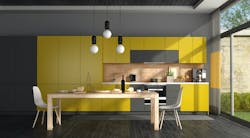
Although it didn't go as far as to select a whole palette, Pantone debuted two Color of the Year options for the first time: Ultimate Gray and Illumination, a bright yellow. “The selection of two independent colors highlight how different elements come together to express a message of strength and hopefulness that is both enduring and uplifting, conveying the idea that it’s not about one color or one person, it’s about more than one,” Leatrice Eiseman, Executive Director of the Pantone Color Institute, says. “We need to feel encouraged and uplifted, this is essential to the human spirit.” This duo marks a departure of other brands’ selections as it incorporates a cool color, but when Ultimate Gray is paired with Illumination, it still stands out from the whites and grays of the 2010s.
HGTV Home by Sherwin-Williams: Passionate
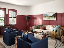
Alright, Sherwin-Williams was already on this list, but the brand’s HGTV Color of the Year is quite different from Urbane Bronze. Passionate is a deep wine color that HGTV says can pair well with whites and natural tones. "Consumers are eager to streamline and simplify their lives and homes, but that doesn't mean we need to forgo having fun with color," says Ashley Banbury, HGTV HOME by Sherwin-Williams Senior Color Designer. "When used thoughtfully in design, color can be immersive and incite emotion. Whether it be monochromatic or colors with high contrast, color is now being used as the main accessory in a space to embody a sense of comfort and confidence." Again, one can imagine this deep red tone paired with warmer tones, potted plants, and wood-galore. But unlike some of the other shades, Passionate could also be easily incorporated into a transitional affair.
Valspar: 2021 Color Palette
Valspar chose not one, not two, but twelve shades for 2021. The tone of the collection is as if the curators took a candy store and the northern woods in early spring and chose the overlapping shades. “Our homes have become offices, entertainment centers and classrooms, which means the colors, sights and sounds in our rooms have an even bigger impact on our daily lives,” says Sue Kim, Valspar Color Marketing Manager. “These lifestyle changes coupled with a surge in DIY home activity helped guide our selection of a range of colors for Valspar’s 2021 Colors of the Year that can not only transform your space but also elevate your mood.” Colors include those such as Succulent, Norwegian Night, and Flannel Gray. Depending on the colors chosen, remodelers could create a room reminiscent of a forest after a spring storm, a sunrise on an in-land lake, or a retro postcard of a day at the beach.

