A 7-Step Checklist for Refreshing Your Website
The new year presents an opportunity to refresh your brand for the year ahead, and taking a look at your website can be a simple first step.
It may be time to revise copy and visuals, and just as homeowners hire your firm for its skillset, it’s your turn to find the best expert to beef up your site. Following these seven steps from fellow remodelers can help you easily and quickly refresh your website.
1. Get a Second Opinion
A second opinion always helps. Start by looking at a variety of sites related to residential remodeling, and if you find ones you like, it can be as easy as contacting the company and asking who designed it.
RELATED: 3 Website Redesign Myths for Remodelers
Many will share information, says Barbara Hicks, founder of B-Graphic in Atlanta, a marketing graphic design firm. If you want to take the next step with a website designer, ask them to show you other sites they’ve designed, share how much they’ve increased client traffic, improved its bottom line, and ask them to provide references.
2. Update Search Engine Optimization (SEO) Keywords
One of the steps most digital SEO experts do is regularly update words to keep attracting Google’s attention since they may have changed from when your site was designed.
Kitchens and bathrooms still rank high but now there’s increased interest in home offices, gyms, bars, and outdoor spaces, all bringing forth new SEO keywords. Additionally, ensure you pair common search terms with your location. For example, Remodeling Contractors in Des Moines, Iowa pops up when a homeowner searches for “remodeling Des Moines.” Why? Aside from “remodeling” in their name, their domain name is “RemodelingDesMoines.com” They also make sure Des Moines is in their website description.
Also, be sure your web developer has indexed your site with Google to speed the SEO process. Negative keywords and phrases are just as important to deflect business you don’t want, says Hicks. For example, you don’t want people to come to you for remodeling software, so don’t use or play down certain words, she says.
3. Add Options to Your Homepage
This is akin to improving a home’s curb appeal to get buyers to enter the front door. Just as there are many features that add curb appeal—a nice walk, plantings, lawn, lighting, so it is with what makes the homepage enticing, such as good photos, videos, copy, company name, and colors.
You should have at least one photo on the landing page that reflects your main service, such as kitchens, pools, and basement redos. These days, most designers use a large image rather than a collage of small ones for a crisp, modern look.
Be sure it shows a recently completed project, so everything looks current. Nothing may turn away visitors faster than dated-looking images. Putting several in a rotating slideshow adds pizzazz and makes the site interactive. BOWA, a design-build remodeling company in Virginia, does this and cites additional services on each photo such as ”Learn about our virtual design capabilities.”
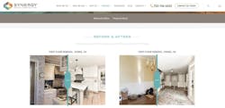
“Before” and “after” images are also helpful to convince people you make major transformations, says Jason Weamer, founder of Orange County, Calif.-based Visual Identity Group, a full-service digital marketing, website, and web development company.
All these lessons also apply to videos, which can attract a bigger audience, Weamer says. And be sure to avoid showing projects in any media that you don’t want to take on to prevent reducing outreach from clients who aren’t ideal, he says.
4. Revisit Your Company Name and Tagline Layout
RELATED: 12 Tech Solutions Remodelers Recommend
Your company name should be splashed big, too, akin to a billboard, and possibly with a tagline such as BOWA’s “Transforming Houses into Homes.” There should be tabs for drilling down for services offered near the top, Weamer says.
For example, BOWA lists Our Story, Design, Project Types, Client Experience, Gallery, Reading Room. Under the Our Story tab, it shares that it hosts webinars. Under the projects category, it includes a novel niche of barns and equestrian facilities.
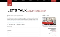
Colors help, too. Neil Kelly, based in the Pacific Northwest, uses a bold red to highlight its name and features such as scheduling a consultation and contacting the firm. It also posts its blog content under a separate tab, covering popular renovations on biophilic interior design, range hoods, and ADUs, which can help persuade visitors you are up on trends.
5. Read Through Your Copy
Besides writing copy in a lively, active tone with lots of verbs and being detailed but not verbose, you may want to provide a short snapshot of how your firm works, which can help lessen client concerns, especially because of escalating prices and COVID-19.
Perhaps, you explain that after an initial conversation or email, you will visit their house to see in person what they envision and explain your Covid-19 protocols. Many firms, such as Neil Kelly, offer this service for free and will schedule a consultation by video.
6. Update Contact Methods
Be sure to make it easy for potential clients to reach you by email or phone, Hicks says.
You may also decide to add a contact form with a submit button if there is not one. But that should be in addition as many homeowners wonder if anyone receives these messages and will respond. If they don’t hear back within a day, they may go to a competitor.
7. Set a Schedule to Measure Data and Update Your Site
Be sure your web developer performs periodic audits of how well your site performs by capturing and analyzing data offered, says Weamer.
How often it’s updated may be a matter of your budget but doing so can be as simple as adding a project with more photos, a video, or blog post. The key is to do it regularly, so Google can help you rank higher.
“We are always doing something to our site—adding a page, switching out a video or adding photos—at least once a month--and that's in addition to uploading new blog content once a month,” says Mina Fies, CEO of Synergy Design & Construction in Reston, Va., the focus of the 2021 Model ReModel home.


