Things are Looking Up
Designers spend an enormous amount of time planning what to do with a room’s walls and floors, but they can miss a great opportunity to create drama overhead.
We’re talking ceilings.
There are few things more boring than the standard 8-foot high, flat drywall ceiling. Sure, you can cut in a skylight, strategically punch in a few downlights, or spring for a decorative pendant or three. But why not do more? You can turn that sixth surface into a real focal point with just a little bit of imagination.
You can use paint, of course, or even wallpaper; both are relatively inexpensive ways to draw the eye up to the ceiling. Another option is adding beams (usually faux); although, if you’re trying to create the illusion of height, beams probably aren’t a feature you want in a room with a low ceiling.
A tray design, however, can be a great solution because a large section of the ceiling is raised. And adding intersecting beams within the tray creates a coffered ceiling, which can add striking visual appeal. This style has its roots in Roman and Greek architecture where the framework of the roof was expressed and decorated. You often see such ceilings in classical civic and institutional buildings. But the style works great in residential settings, too.
Check out these remodeling projects where tray and coffered ceilings completely transformed the spaces, and see if any of these ideas spark your imagination.
Reaching Greater Heights
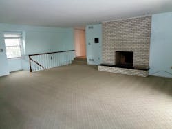
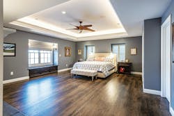
This 1970s, two-story, French-inspired home (note the mansard roof) had an enormous primary bedroom that stepped down from the main second-floor level and a staircase that connected it to the family room below.
The bedroom ceiling height was very low at 7 feet 10 inches, which in such a vast space (the room is 21’ x 28’) made it seem even lower. When a structural engineer evaluated the home, he discovered that the roof was significantly under-engineered and we had to add a number of microlams to bring it up to code. We devised a plan that beefed up the structure from below allowing us to create a large tray ceiling (15’ x 12’) that increased ceiling height to 9 feet 3 inches in the middle so the whole room felt taller, particularly with soft LED uplighting added around the perimeter.
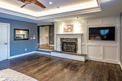
There was no need for the staircase leading to the family room, but there was a need for more closet space, so we lost the stairs and gained space for side-by-side walk-in closets. The original fireplace in the bedroom had a nice raised hearth, but was very plain and forlorn. We reimagined it with painted paneling that unified the wall and provided a focal point for the bed.
Revealing A Condo Ceiling
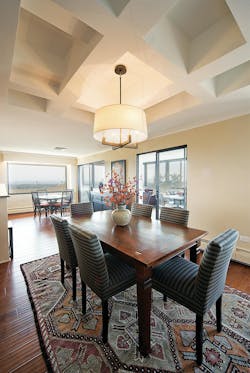
This 19th floor condo doesn’t have an attic, but we suspected there was wasted space above the eight-foot-high drywall ceiling. We were right—there was about 5 inches from the ceiling to the bottom of the concrete twin T’s, and almost a foot to the slab above. We captured that space for an articulated ceiling over the dining table. Being a high-rise, we used metal studs to wrap the T’s and placed faux beams perpendicular to the room and then finished it with drywall.
Creating Skylight Central
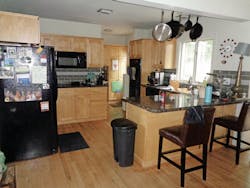
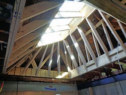
Why add one skylight to a kitchen when you can add two or three? Punching through the unused attic space above the kitchen in this home (below) created a large skylight shaft. A patio cover outside the kitchen window blocked direct sunlight, so we reached for the sky and added side-by-side-by-side skylights that flood the space with daylight year-round. The skylight shaft was not extended to the walls because we wanted a flat soffit that housed downlights.
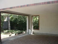
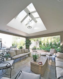
Skylights also worked wonders in a 1970s contemporary (below) that had a dark, uninviting patio in need of both natural light and a focal point. We created a large coffer and added eight skylights in a peaked roof monitor that makes the patio feel like a true outdoor space. The skylights are double paned so they refract heat and help keep the patio cool.
Enlarging A Bungalow
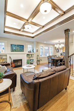
As part of a pop top on a 1928 bungalow, the homeowner wanted to add more functionality, detail and drama to their living room/entry.
The functionality comes from a new mudroom niche that was built into space stolen from a bedroom closet (we retained the original entry closet). We anticipated that the homeowner’s kids wouldn’t open a closet door to put their coats away, so we designed the space for how they actually live: hooks for coats, cubbies for shoes and boots, and a bench with lift-up seat for hats and gloves storage.
We added the detail and drama with a coffered tray ceiling. It’s topped with OSB so the attic space above it can be used for storage—in this house, we can’t afford to have wasted space.
The detail of the coffer itself is further emphasized by layered lighting. There are two traditional Arts and Crafts hanging fixtures for ambient light, six downlights, and LED tape around the entire perimeter. All three light systems are controlled separately on dimmer switches to allow the owners to adjust the lighting to their needs and mood.
The client gave the project a rave review. “Our eastern-facing, lit-by-a-single-pendant living room was never a highlight of our 1920s bungalow. But being the front room of our home and our only option for a family hangout space, it was used heavily and daily. Still, I always felt self-conscious about entertaining guests in this room, so at these times it served mostly as a pass-through to the lighter, brighter, and more welcoming kitchen and sunroom,” the homeowner says. “The coffered ceiling is a gorgeous entrance spectacle (we get complements galore), and the layers of lighting implemented into the coffer make this room come alive.”
Floating The Soffits
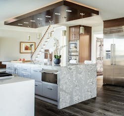
If you can’t go up, consider coming down, especially if the space has tall ceilings. My friend Adam Gibson, an architectural designer based in Carmel, Ind., is a master at floating soffits, even in kitchens with eight-foot-high ceilings. Gibson says he floats them no more than six inches below the ceiling height and often over kitchen islands to emphasize the architecture. “I like the slight sense of compression at the work surface,” he says. The dropped soffit also has the added benefit of better illuminating the prep surface because downlights are slightly closer to the countertop. LED tape is often wrapped around the recessed perimeter to add a soft glow to a space.
Finding Space In The Attic
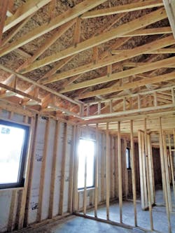
Most homes built before 1960 have stick-built roofs (not trussed like modern homes) with rafters below that. This system presents a golden opportunity to carve out ceiling volume for a room by borrowing unused attic real estate. If you are constructing a trussed-roof addition or building a new home, you can integrate raised ceilings into the truss design. This Colorado home has raised heel trusses to accommodate an R60 ceiling insulation package.
Taking a section of the ceiling and raising it a foot or more can make the entire ceiling feel much taller, and adding beams or a coffer within the tray adds architectural detail. Uplighting can be hidden in the sides of the tray to cast a glow on the raised portion. The ceiling of the tray typically is flat, but it doesn’t need to be—add a vault, a barrel vault, or a dome.
When adding a tray or coffer ceiling element, you’ll need to account for the interrupted diaphragm function that the old ceiling joists provided, but that’s not too difficult.
“In many older homes, the ceiling joists are critical in providing lateral bracing for a roof system consisting of roof rafters and ceiling joists,” says Kyle Swartz, a structural engineer with Censpace in Colorado Springs, Colo.
Final Word
As you see, plain ceilings (and those beyond plain) can be turned into focal points that add visual interest and elegance to any room. But I’ll leave you with this advice: avoid overdoing it. We typically add a tray or coffered ceiling to one room per home—often the living room, dining room, or the primary bedroom.


