Kitchen Design: When Two Islands Are Better Than One
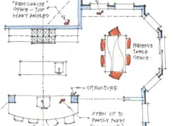
The existing plan was fairly modern, with the kitchen adjacent to an eating area and family room. As is typical in homes of this era, angles were used to add interest to the space. The homeowners wanted to update the kitchen and asked for a more open plan that would enable them to interact with family or guests in the eating area or family room while preparing a meal.
We like to present clients with more than one design option. One reason is that our first answer may not be what the client had in mind. But we also think that being able to compare solutions is a powerful design tool. Sometimes clients have to see a solution that is merely decent before they can appreciate a solution that is much better.
Existing Angles & Odd Spaces
A quick analysis of the existing space reveals a few problems. The kitchen is completely disconnected from the family room by full-height walls, and several angled walls create awkward confi gurations. Also, there is too much unused floor space in the center of the kitchen. Troubles aside, the plan also has a few benefits. The eating area is full of light and offers good views to the backyard. The family room, while not very well connected, is immediately adjacent to the kitchen and eating area.
Good but Not Great
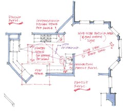
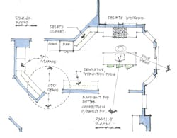
The wall between the kitchen and family room was bearing and the homeowner was hesitant to change it, so this first scheme leaves the wall in place and works within the confines of the existing plan. It also acknowledges that one priority for this project—improving the connection to the family room—was so important to the clients that they were willing to sacrifi ce the eating area to achieve this goal. While this solution checks the boxes for several program requirements, it results in a kitchen that’s too long and irregular, and that doesn’t have much order—it rambles across the space. So we went back to the drawing board.
Two-Island Rescue
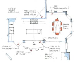
This was our second try, and the one that the homeowners eventually built. It cleans up all of the odd spaces created by the existing angles and brings some order to the plan. We entirely removed the walls separating the kitchen from the family room, and preserved the eating area, which was one of the highlights of the existing space. The key to this solution was using two islands, one of which extends the kitchen beyond its original boundary into the family room. This allowed us to introduce a secondary prep island that fi lls the formerly unused open area in the center of the original kitchen. Creating a square corner at the interior of the dining room added wall space for cabinetry in the kitchen. A plan that is open to the family room, maintains the eating area, provides plenty of storage and countertop space ... I think we have a winner.


