Our subject this month is a kitchen/eating area project. The design boundaries are well defined: The homeowner is open to any suggestions within the existing space, but does not want to move any walls other than the one separating the two spaces. Our goal is to create an up-to-date kitchen with more storage.
Awkward Sizes and Shapes
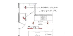
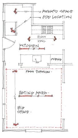
A quick analysis of the existing space reveals a few challenges. The kitchen has a small, awkward area attached to it that puts the fridge in an odd spot. This small area also creates an L-shaped space, which I find difficult to work with, especially in kitchens. I often try to transform L-shaped spaces into square or rectangular shapes.
The proportion of the spaces feels wrong to me, too—the eating area shouldn’t be bigger than the kitchen. And then there is the traffic problem: The existing kitchen is a thoroughfare for reaching the side door.
Squared Off
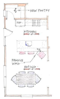
In our first scheme, we take down the wall to open the kitchen to the eating area, leaving the sink in its current location but extending the countertop to create a seating area. Adding a short section of wall squares off the kitchen and gives purpose to the odd area as a walk-in pantry, which helps add storage. It also provides us enough wall space to rotate the refrigerator and attach it to the end of a run of cabinetry, leaving the range more or less in the same place.
Not a bad first scheme: Good solid ideas that keep costs down. But it’s pretty predictable. What can we do to wow this client?
Better Proportions
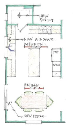
This scheme is a bit more ambitious. It starts with an attempt to find the right balance in the proportions of the spaces by expanding the kitchen. This requires replacing the side door with new doors in the eating area, which shifts the traffic pattern but still leaves plenty of room for a table.
Flip It
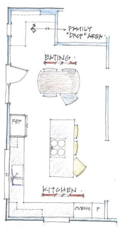
Here, we go all in, flipping the kitchen and eating area locations.
Why? For starters, it preserves side-door traffic patterns, but now the traffic passes through the less-busy eating area. This cleans up the circulation problem without having to replace windows and doors. It also creates a convenient “drop area” for the family. Also, the kitchen now has a much more efficient layout. While I would rather group the tall objects (refrigerator and wall ovens) together, the existing window prohibits that arrangement. We can introduce that idea when we meet the client, if they are interested in pursuing this scheme further. Some of this is theater—we want to hold back a little bit of our story to keep things interesting.
Bill Millholland is an executive vice president at Case Design/Remodeling, in the Washington, D.C., area. [email protected]
