Design: Powder Room Reshuffle in a Washington, D.C., Rowhouse
Many of the Washington, D.C., metro-area homes we work on were built 50 to 100 years ago. Evidently people back then had much larger bladders than people do today because the vast majority of homes built in that time frame didn’t have “facilities” on the first floor. As a result, a very popular project today is to find a way to add a powder room or half-bath.
In this row house, however, a powder room was added during a previous remodel. Woohoo! A simple pull and replace and we’re done, right?
Not so fast, nothing is that easy. People in 2016 value connected spaces, so our clients want an open floor plan that includes the kitchen. And the powder room is in the way.
The existing space is pretty good, but our client isn’t happy with it. So how do we make it better?
Poor Circulation
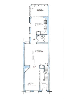
Front to back, we have a pretty typical setup (below) for a row house of this era—living room, dining room, kitchen. But with no central hall to organize the adjacent space, circulation is through the spaces themselves. This works well in the living room because we are using the edge of the space as an implied hallway. But the situation changes in the dining room, where traffic must move right through the center of the space, effectively dividing it in two. Maybe there’s an opportunity to address this in our schemes?
Scheme A: Line ’Em Up
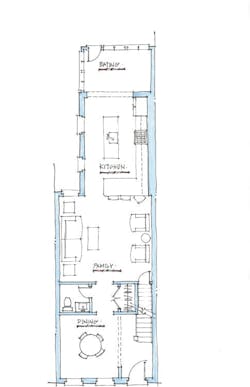
Our first stab at solving the problem picks up the line of the entry and closet to organize the space. In this scheme, we also introduce a “back hall” with access to the basement stair. It also helps provide some privacy for the powder room, which we have moved toward the front of the house. A little bit of leftover space becomes a pantry. Our new wall makes a great place to mount a big TV screen, so the living and dining rooms have swapped locations.
This scheme works pretty well, but I think we can do better. Circulation is improved, the powder room location has some privacy, and we’ve managed to squeeze in a small pantry. But our primary goal of improving the “openness” of the kitchen needs work.
Scheme B: Traffic Jam
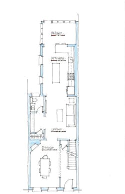
This option once again adds a hallway to the plan, but this time it’s between the living and dining rooms, which again have swapped locations. We did this for two reasons: to avoid having the powder room open into a room, and to open up the kitchen. To make this idea work, we had to remove the fireplace. It’s a pre-fab unit that had been added to the home … I wouldn’t be sorry to see it go.
This idea accomplishes our goal of a better-connected kitchen, creates a bigger closet, and results in a larger family/living-type space. But these gains aren’t without cost. We still have the problem of circulating through the center of a room, and the dining room has been moved to the front of the house.
Let’s give it one more shot.
Scheme C: Pantry Rescue
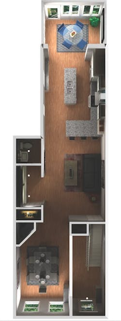
Our third run at it looks at another location for the powder room and weaves a butler’s pantry/built-in area into the plan. It creates a very open plan and, while it still shows the dining room at the front of the house, it could easily accommodate flipping the living and dining room locations.
Pick and Choose
We present three options to homeowners because clients tend to like parts of different schemes. That is just what happened with this client. They liked the powder room location of scheme C, but the kitchen layout of scheme B. We were able to combine those elements into a plan they are excited about.
Mission accomplished. We start next month.


