THE NEW AMERICAN REMODEL
Las Vegas, Nevada
Sponsors: The National Association of Home Builders and Professional Remodeler magazine
Architect: Phil Kean Design Group, Winter Park, Florida
Remodeler: Josh Anderson, Element Building Company, Henderson, Nevada
Interior Designer: Josh Moser, Element Building Company
Existing home interior covered floor area: 2,170 sq. ft.
Remodeled home conditioned space: 4,800 sq. ft.
Remodeled home total indoor
and outdoor living space: 6,711 sq. ft.
Bedrooms: 5
Full baths: 4
Half baths: 2
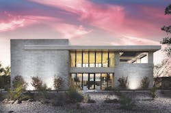
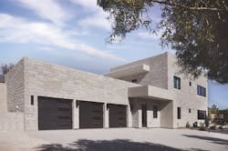
Architect Phil Kean wanted a mid-century modern look with a feeling of elegant simplicity. The result is a facade defined by clean, horizontal lines and just a few different materials. Rather than grass, the front yard is covered with drought-friendly plants and small-diameter river rock—a response to Vegas’s low water availability, as well as a conscious design decision. The home looks like it grew from that sea of rock. The old driveway at the front of the house ran over the septic tank and leach field, which violated current codes. The new driveway runs along the side of the home and ends at a three-car garage in the rear.
This year’s New American Remodel in Las Vegas is an eye catcher. What started as a single-story, 1970s Spanish-esque ranch—a style typical not just of Vegas, but the sunbelt in general—has been reincarnated as what architect Phil Kean describes as “a two-story blend of modern design and desert contemporary.”
The big architectural message Kean wanted to convey is that a home featuring contemporary or modern design need not feel stark or cold. Given the right material choices, it can be quite warm and inviting, and even better, those material choices don’t have to break the bank.
For instance, many homes in the Las Vegas Valley are, in no official terms, basically stucco boxes. The more attractive ones add stone veneer as an accent. For this project, Kean flipped that convention on its head. The exterior facade’s defining feature is its manufactured stone siding, with stucco relegated to narrow bands at the roof and front entry. The stone gives the home a feeling of texture and depth, and the fact that it’s a manufactured product makes it very cost-effective.
Great Room
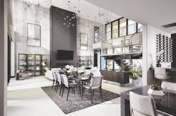
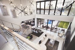
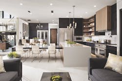
The front door leads to a two-story great room surrounded on three sides by glass and stone and on the fourth by an opening to the kitchen. Its most stunning feature is an array of three-dimensional hanging fixtures installed around the room at different heights. What could have been an empty void has been transformed into a captivating visual element.
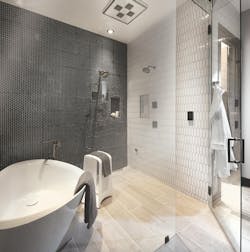
Inside the home, interior designer Josh Moser continued the theme of contemporary warmth by specifying items that invite touch and feel. These include stone siding on one of the great room walls and three-dimensional wall tiles in baths and powder rooms. He also complemented the interior walls’ light color palette with doors and cabinets made from natural dark walnut. “All these materials are very accessible,” he says. “Our goal with these choices is to provide visitors with ideas on how to create a feeling of high design without excessively high cost.”
Of course, at 4,800 square feet, this isn’t your average residence. It’s in the mid-range of what luxury custom home buyers want. “A size range of 4,500 to 5,500 square feet seems to be the sweet spot for the luxury Vegas market,” says architect Kean. The home also offers all the amenities for which those buyers are looking: a three-car garage; family room; bar area; wellness suite; his-and-hers walk-in closets; an outdoor living area; and a kitchen conceived with entertaining in mind. There’s even a residential elevator.
Master Suite
The master suite has everything one would expect in a luxury home. There’s a fireplace and TV, his-and-hers walk-in closets, and a view to the courtyard and tree. A custom soffit over the bed breaks up the ceiling plane and accommodates recessed lights. The suite also features a modern-designed master bath with double sinks, a custom vanity, and a soaking tub placed in an enclosed steam shower.
Raising The Bar
Situated south of the city, just west of Las Vegas Boulevard, the neighborhood around the 2020 New American Remodel is ideally located. Hop in the car, and you can be at the Bellagio at the center of the Las Vegas Strip in about 15 minutes. You can reach the airport, or the new Raiders stadium, in 10 minutes. Easy access to those amenities was one reason Element Building Company’s Josh Anderson, the remodeler and project owner, chose this spot.
Another reason is the potential of Vegas’s southside. It was passed over during the development frenzy that gripped the city during the early 2000s and has since remained relatively under the radar. But that seems to be be changing. A Las Vegas Review-Journal article noted in 2018 that there are several condo and apartment projects planned for the area, and while many nearby lots are too small for planned communities, they seem ideal for custom homes.
Kitchen and Bar
The kitchen offers ample surface area for prepping food, as well as for serving during parties. Amenities for the cook include high-end appliances, some of which are “smart,” a wall-mounted pot filler, and a multi-use sink. Although the kitchen opens to the first floor great room, it’s tucked in a corner where it’s not the first thing visitors see.
The bar next to the kitchen showcases a custom wine rack. It’s just big enough for a bartender to work during parties.
Finally, the neighborhood’s existing homes are strong candidates for remodeling. Many are more than 30 years old, and their eclectic design styles and lack of covenant restrictions (there’s no HOA) give architects and contractors more creative freedom than they enjoy elsewhere in the Valley.
Kean and Anderson see the revitalized structure as a beacon of sorts: an example of the how architects and contractors can raise the design bar for this part of town.
Remodeling Challenges
While the result certainly accomplishes what its architect and remodeler intended, getting to it was anything but easy.
Old houses have secrets, and in the case of this home the biggest secret was termite damage—the extent of which was not fully realized until demolition began. It quickly became clear that the exterior walls would be unusable—all of them. The only thing Anderson could realistically salvage was the slab. That extended the project’s schedule and required a lot of overtime work to meet the deadline.
Courtyard
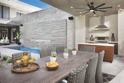
Multi-slide glass doors in the master bedroom and great room open up to an interior courtyard that wraps around a mature mulberry tree and 240 square feet of fescue grass. A soaking pool, an outdoor kitchen, and decorative steel panels define the courtyard’s other three boundaries, while white noise from the pool’s waterfall blocks out the din of a nearby road, creating an effect similar to that of a soothing desert oasis.
Fortunately, the termite issue didn’t require any design changes. The plan all along was to keep the front part of the house on the existing footprint, while building an addition at the back, where it would be invisible from the street. That’s why the home seems smaller than what you’d expect from 4,800 square feet of floor space.
The rear addition actually solved a major design challenge: a noisy highway that runs along the back of the half-acre lot. Kean and Anderson wanted an outdoor living space, but making the space usable required nullifying the effects of the highway.
They did so with the thoughtful placement of an outdoor kitchen, a bamboo screen, and a pool with a waterfall. When the homeowners are lounging on the covered lanai, the main thing they will hear is the soothing sound of that falling water. The outdoor space also has a direct connection to the master bedroom, great room, and kitchen, giving it a central role in the home’s private and public life.
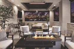
Challenges weren’t the only thing the original home presented, though. There were also opportunities, the most compelling of which is a great view of the Vegas strip. The design team took advantage of that view with a second-story covered terrace on the home’s north side. It’s shaded from the sun in summer and includes heat as well as operable screening, which should make it a popular gathering spot throughout the change in seasons.
As with any remodel, written descriptions, however accurate, don’t really do the project full justice. To really grasp how these spaces work together, you need to experience them. If you’re at the 2020 International Builders’ Show, you’ll have that chance. The home will be open for tours all three days of the show, from January 21-23. See you there.
Second-Floor Terrace
The original plan included a second-floor terrace covering half the width of the north wall. However, the nighttime view to the Strip was so good that Anderson extended the terrace across the entire wall. Operable overhead louvers can be controlled remotely and are also wired to a rain sensor, which automatically closes the roof when wetness is detected.
Additional Features
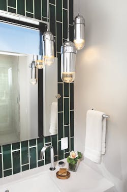
The home features a variety of designer light fixtures, such as these “pill” lights.
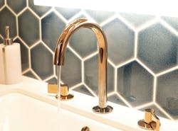
This faucet showcases two popular finishes by transitioning from titanium at the base to rose gold at the spout.
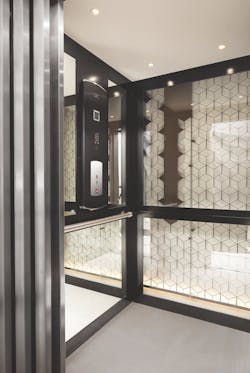
The elevator has glass walls, and a shaft lined with custom-made decorative steel panels.
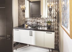
A smart mirror in the second-floor powder room has built-in lighting that can be adjusted by voice control. The homeowner can also tune in to weather reports or tell the system to update the home shopping list, just with their voice.
About the Author
Charlie Wardell
Charlie Wardell is a freelance writer and former remodeler in Tisbury, Mass.
