Updating a Galley Kitchen
In the 1920s and ’30s, bungalows and Tudors—like this Park Hill Tudor in Denver—had small galley kitchens with even smaller breakfast “rooms.”
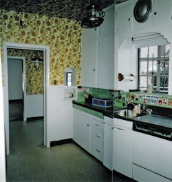
The kitchen connected to the yard via a tight stair down to the back door (and on down to the basement), and the window over the kitchen sink looked right into the window of the neighbor’s kitchen.
The Challenge
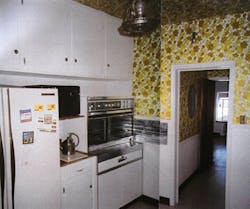
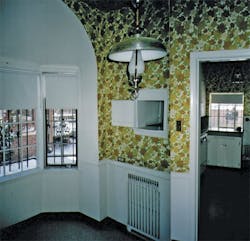
This kitchen had some of its original cabinetry, plus modifications from the ’50s, and sunflower wallpaper from the ’70s—time travel without leaving the room!
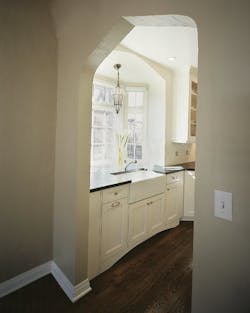
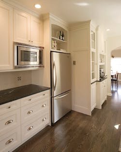
The owners wanted a retro feel but with modern appliances, so we chose classic white painted cabinets with bin pulls and knobs and matte-finish soapstone for the countertops. A farmhouse sink adds to the retro feel.
The Solution
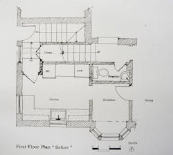
The solution to this kitchen started with contractor Tom Owens of Creative Remodeling, in Aurora, Colo., removing the wall on the kitchen side of the breakfast bay, which combined the spaces into one.
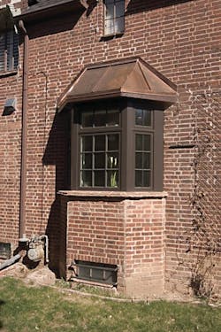
Since the bay window was the most interesting and sunniest part of the space, we moved the sink there, which involved rebuilding the bay and raising the sill and head.
New Pella mullioned windows were specified for the main sash and transoms and a new copper roof to cap it all. Compact blinds give privacy when needed.
New hardwood to match the adjacent dining room makes for a seamless transition, while the doorway between the two spaces was widened and a peaked arch detail added to match other doorways in the front of the house. After we were done, the owners commented, “This is the kitchen this house should have always had.” It has a substantial, old-fashioned feel.
Getting Away From the Galley
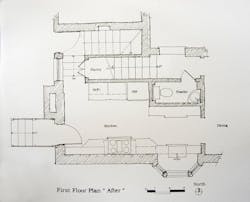
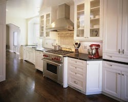
To avoid the monotony of the relentless galley that this kitchen could have had, we chose to articulate the cabinetry, pushing and pulling it in response to function and architecture.
Where the bay pushes out, we stepped the cabinetry and counters out toward the light. This also creates more space in front of the breakfast bar, which is done in shallower than normal cabinetry and repeats in a minor way the push-pull in the cabinetry and counter.
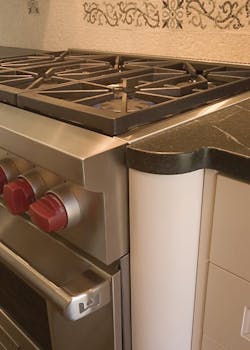
To highlight the importance of the cooking function, we deliberately pulled the cabinets into the room for about 2 feet on either side of the Wolf range. A small rounded detail pulls the range in about 2 inches farther, giving a bit more space behind.
About 2 feet to the right of the range, the cabinetry steps back 12 inches clear to the new French door, and that line becomes the line of the sink cabinets at the other end of the layout. The only straight cabinetry run is on the inside wall, where the Amana refrigerator tucks into the corner behind the powder room.
The old over-the-sink window was filled in, which allowed us to feature the range on that wall. To compensate for reduced natural light and to ease up the traffic flow, we enlarged a small existing window to make room for a new French door, giving direct access to the backyard from the kitchen. This door lets in way more light than the window ever did and provides good afternoon illumination.
A new stoop and stair lead down to the yard, or you can also get there via the original stair and nearby back door.
The Takeaway
Don’t be afraid to experiment in planning your kitchen layouts. Pay attention to NKBA-recommended clearances and standards, such as landing spaces on either side of ranges, sinks, and refrigerators. But standards are like codes—they are a minimum. Take advantage of your innate creativity and sense of fun to articulate the cabinetry to fit the space and the function. No more boring kitchens!
