TNAR: A Strong Finish
Great houses, like great people, can grow over time without losing the defining parts of their character. Instead, they become better versions of themselves.
That’s certainly the case with the New American Remodeled Home, unveiled during the NAHB International Builders’ Show in Orlando this January. It’s a radical transformation with a modern addition built around a historic 1937 core structure. The interior design harmonizes the old and new while retaining the core’s essence.
The pre-renovation interior was bland and dated, with yellow walls and small rooms that felt cramped despite 3,000 square feet of conditioned space. It was also an energy hog: Energy consultant Drew Smith described it as one of the most inefficient homes he had ever seen.
The renovation fixed all of that. Remodeler Farina & Sons expanded the conditioned space to around 4,000 sq. ft., but because they also built high ceilings in the addition and removed some walls, the home feels even bigger. It also uses less energy, thanks to good insulation and air sealing, efficient mechanicals and LED lighting. In fact, the finished project is so efficient that it earned an Emerald rating from the National Green Building Standard.
But what really sets this home apart is its attention to detail. Interior designer Grant Gribble and architect Mark Nasrallah wanted to preserve the home’s connection to the time when it was built, while updating it for contemporary lifestyles. They achieved that with intelligent space planning, transitional design elements and thoughtful color choices.
First Impressions
To a visitor, the home’s rooms open up in steps. The original structure retains its low ceilings, but where there was once a cramped kitchen at the back of the dining room, there are now two large archways that let the living and dining rooms flow seamlessly into the addition’s open-plan common space.
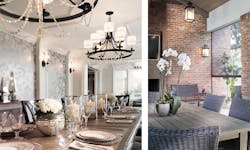
Left: Clean moldings, coordinating light fixtures and reclaimed wood flooring give the dining room an elegant charm. Before the remodel, a tiny kitchen occupied the back half of this space, which is now fully open to the new addition. Right: A gas fireplace, custom overhead fans and retractable screens make the outdoor living room an inviting space. Lowering the screens and opening the sliding door make this area an extension of the family room.
Although the old and new spaces are very different, Gribble used trim and paint to skillfully knit them together. For instance, he specified a tremendous amount of interior wood trim, but opted for molding profiles with clean lines, which work in all parts of the home.
While the moldings make a strong impression, the paint is the unsung hero of the design scheme. All the wall paint in the house comes from Sherwin-Williams’ Duration line, but the standard colors were custom-mixed to have only 50 percent of the usual pigment to soften the hue.
The interior wall paint also includes a gray undertone to help unify the space. Each color also serves a specific purpose: For instance, the green/gray color in the master suite (called “Sea Salt”) is meant to aid sleep.
Engineered Wonders
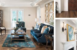
The transitional design theme continues with the home’s products, some of which have a traditional aesthetic, but are marvels of modern science and engineering. One of these is the first thing a visitor encounters when stepping through the front door: the variegated wood plank and parquet floors in the hallway, living and dining rooms.
Wood floors are authentic to the home, and while these look and feel like solid planks they are actually an engineered product from Authentic Reclaimed Flooring. The company sources wood from old buildings, slices them thin and marries the slices to a plywood base. Unlike some engineered floors, it’s nearly impossible to tell them from the real thing.
In the new gallery space directly behind the old wing, workers have skillfully interwoven the engineered wood flooring with floor tile from Crossville. The tile, which extends through the kitchen, family room and outdoor living room, comes from the company’s Moonstruck line, a porcelain product the color of sandstone.
After the floors, the next thing to catch the eye is the dining room light fixtures: two circular chandeliers hanging above the long table and four sconces mounted on the wall columns. Like all of the home’s fixtures, these are from Progress Lighting, which supplied a wide range of fixture types and styles. The fixtures’ candelabra bulbs are energy-saving LED’s controlled by Eaton dimmers.
The kitchen was made for serious entertaining, with a professional grade range, large built-in refrigerator, and two islands. Like the rest of the house, the cabinetry and fixtures have a transitional aesthetic, as does the silver travertine backsplash behind the custom range hood.
The home’s interior doors were supplied by TruStile. Most are molded mdf doors, painted white, that feel like heavy hardwood when you open and close them. (The only exception is the dark-paneled bonus room above the garage, which has a different look than the rest of the house and includes wood TruStile closet doors with leather inserts.)
Comfort and Convenience
The home’s interior offers high, finely detailed ceilings and large Loewen windows to bring in lots of natural light.
The “interior” space also includes a covered outdoor living area at the back of the family room with a vaulted ceiling supported by brick columns. It’s a flex space that quickly converts from a roofed-over patio to a screened-in porch. Pressing a button on a hand-held remote causes motorized screens from Phantom Screens to lower from a faux overhead beam, filling the openings between the brick columns. The screens’ tracks have been recessed into the columns.
The outdoor room includes an overhead fan that Progress Lighting customized to match the room’s hanging lanterns, as well as a gas fireplace and built-in TV that serve as a visual focal point. The fireplace surround appears to be metal, but is really a ceramic tile called Laminam from Crossville. The 10-mm-thick tile can only be installed by certified installers.
Gas piping for the fireplace (as well as for all other gas appliances) is TracPipe CounterStrike from Omega Flex, a flexible stainless steel tubing with a polyethylene sleeve. It’s crush-resistant, bends around curves and comes in long segments, which reduces the number of connections needed.
Opening the Loewen Lift-N-Slide door and lowering the screens makes the outdoor living room and the adjacent family room a single space. To blend them visually, the same floor tile and vaulted ceiling design extend through both rooms (although Farina lowered the family ceiling a bit to make the space feel more intimate.)
Cook’s Kitchen
The new kitchen is a major upgrade in functionality and design. It’s made for a cook who loves to entertain.
Designer Julie Collier of Signature Kitchens spent a lot of time exploring island configurations with the homeowners and interior designer. They decided that a single island would be too big. They also considered a smaller island and a table, but ultimately settled on a work island and a serving island. Placing the stools on the side of the serving island nearest the cook lets people sit and visit, or have a meal or coffee with a view to the outdoor living room. During parties, the stools are out of the way of the cook and the other guests.
The cabinets are from WoodMode, a custom manufacturer that can make boxes to within 1/16 in. of any desired size, according to Collier. “The recessed panel on the door, along with the simple clean lines of the trim detail, give the design a more transitional feel,” she explains.
The quartz countertops are from Caesarstone. The faucet is a Tournament semiprofessional model from Kohler and the lighting is LED from Progress, as in the rest of the house.
Collier divided the kitchen into three zones. The left-hand wall includes a cold storage area with a built-in freezer, refrigerator and wine cooler, all from Thermador. The cooking zone starts on the same wall, with a built-in coffee maker, microwave speed oven and warming drawer, but then wraps around to the kitchen’s workhorse: a 60-inch Thermador Pro Grand Dual Fuel range, or “culinary center,” with a custom range hood.
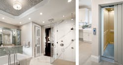
Left: White porcelain marble-look floor tile, a clear glass shower enclosure, designer fixtures and plenty of natural and artificial lighting give the master bath a bright, elegant feel one can enjoy while relaxing in the soaking tub. Right: The bonus room above the garage includes in-wall plumbing, a walk-in closet and a residential elevator. These features make it easily convertible to a suite for aging parents at a future date.
The range includes two ovens: a 4.9-cu.ft. steam & convection combination oven plus a 5.7-cu.ft. convection oven that’s big enough for a caterer’s sheet pan. There’s also a warming drawer, a 24-inch-wide double griddle and six gas burners. The three-dimensional design—bold knobs, beveled doors, a large oven temperature gauge at the front of the unit and thick, restaurant-style fingers on the burner grates—attract the eye and make the range a design statement in its own right.
A local artisan fabricated the hammered zinc range hood cover, which hangs from a wall of silver travertine from Esmer tile. The hood and tile serve as a focal point at this end of the long view from the kitchen to the outdoor living room, the same way the fireplace and TV do on the other end.
The right-hand wall is the dry storage zone. It includes stacked WoodMode cabinets for china, glasses and such, as well as a food pantry behind French doors with opaque glass panels.
Clean and Serene
The New American Remodeled Home’s bath delivers a serene, soothing experience.
It includes a centerpiece soaking tub and plumbing fixtures from Kohler’s Kallista luxury line. Kallista collaborates with well-known designers to make collections named after them, and the fixtures for this bath come from the Michael Smith collection. The walk-in shower has two body sprays, a rain shower, a standard showerhead and a hand-held showerhead. The tub filler includes a hand-held sprayer.
Other products here give the bath a bright, open feel. The walls have been painted a light gray, the shower surround is clear safety glass, and there’s plenty of overhead lighting.
Surfaces consist of Caesarstone countertops, and floors and shower walls clad with the same Crossville Laminam tile used around the outdoor fireplace. The difference here is that the tile replicates Calcutta marble, but of course the fact that it’s porcelain means it won’t stain. The wall tile has a smooth finish, while the floor has been textured for slip resistance.
The room also includes a Crestron screen next to the makeup desk that controls the home automation and HVAC system and doubles as a TV.
The remodeler chose the SharkBite plumbing system for all the home’s plumbing. It uses push-to-connect fittings rather than soldered connections that greatly reduce installation labor.
Health and Accessibility
To help people breathe easier in the bath as well as the rest of the home, the remodeler included an Air King QuFresh fresh air system. It brings fresh air to the interior, but includes internal sensors that limit the flow when it’s too hot or humid outside, which is obviously a great feature for Florida.
The homeowners wanted the bonus room above the garage to be easily convertible to an in-law apartment at some point, so Farina built a large closet and put rough plumbing in walls. To make the room accessible for someone with mobility issues, they also linked it to the first floor with a Garaventa elevator. It’s a residential elevator with commercial style inner and outer doors that automatically open and close together. That’s unlike older residential elevators, where the user had to close an inner and outer door before it would operate.


