Contemporary Living With Period Flair
Remodeler Eric Gray’s Orlando home was a long-time neighborhood favorite. So much so that several people have knocked on his door over the years asking if he was interested in selling. Now that his home is The New American Remodel 2022, he should expect more of such inquiries.
This project continues the thread that connected the last three TNARs: updating mid-century modern home for 21st-century living. But at the same time, it’s very different from those remodels. That’s because Gray took great care not to lose the elements that had always drawn people to his door. The goal from the beginning has been a thoughtful combination of preservation and transformation.
MAINTAINING CHARACTER
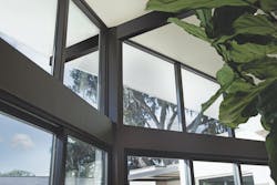
This year’s New American Remodel is a unique example of mid-century modern architecture inspired by Frank Lloyd Wright’s work. Windows at the front show off the interior design and offer a view through the home to the backyard, especially as dusk approaches.
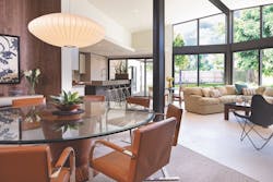
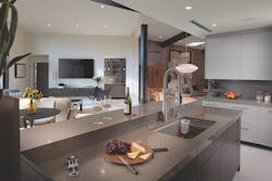
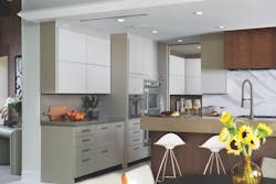
Although Gray took pains to preserve the 1960s look of the great room, the kitchen and family room at the back of the house were designed to satisfy contemporary tastes, with an open layout, high-tech appliances, and sleek cabinetry.
The home, built in 1963, certainly demanded such care. Project architect Phil Kean calls it “the sexiest mid-century home in Orlando,” with a geometry that resembles some of Frank Lloyd Wright’s Usonian designs.
Like many of the area’s mid-century homes, it has vaulted ceilings and expansive walls of glass. A central great room runs the length of the house and includes a ridge beam that rises in elevation above the deck from the front to the back. The gables at either end are filled with windows and doors that offer views to the backyard and the lake across the street.
Late in the day, just before dusk, when the interior lights are on, passers-by can see right through the home to the backyard. This dramatic effect was always a big part of what drew people to stop and look.
However, those dramatic glass areas don’t overwhelm the architecture. Visually, the structure is firmly anchored in place by vertical columns that flank the front-facing windows and by a short bearing wall in front. Both are built from coquina stone, a Florida limestone that consists mostly of fossilized seashells. Inside the great room, counterpoints to the glass include a stone fireplace and mahogany-sheathed walls.
This grounded modern aesthetic has been and still is the home’s calling card. However, before the remodel, the good looks concealed some weaknesses.
Those weaknesses weren’t structural—the bones were solid—but instead had to do with livability and performance. For instance, the bedrooms on either side of the great room were small and cramped, and the home lacked most of the amenities today’s homeowners want.
And with a HERS score of 115, which is 15% less efficient than the average new code-built home, its performance was nothing to brag about.
The remodel needed to correct these weaknesses while also maintaining the home’s essential look and feel. The goal was a blend of 1960s ambiance with 21st-century comfort and convenience.
Windows in the back are flanked by two outdoor rooms and face an outdoor living area with a pool and a fire pit. Stone work combines native sandstone and manufactured stone. Rendering: Phil Kean Design Group
Design Decisions
Although the 59-year-old structure’s 2,600 square feet of floor space made it relatively spacious for its time, it was small by today’s standards. Some of the new amenities added during this remodel went into 1,100 square feet of additions, including a gym, a new primary suite, and an extension of the great room. Gray also built a new 1,000 square foot cabana at the rear property line.
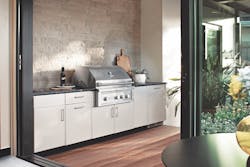
The kitchen has also been fully updated: it’s open to the great room and includes new cabinets and appliances. There’s a new mudroom/butler pantry between the kitchen and the garage, and a new outdoor kitchen resides next to the main kitchen, where it’s easy for the cooks and servers to move between the two, a setup made for entertaining.
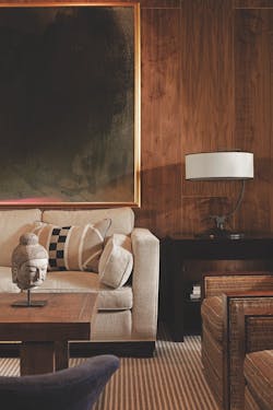
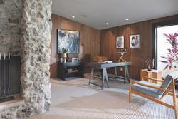
To maintain the original period feel of the central great room, Gray carefully removed the mahogany wall panels. Although he had originally planned on re-installing them, he changed his mind and opted instead for walnut (½-inch walnut plywood to be exact). He says walnut would have been considered an upgrade at the time the home was built.
In the bedrooms, Gray decided to keep the existing 7½ foot ceiling heights because those were authentic to the 1960s. However, he did add a new home gym at the back of the house with a 9-foot ceiling to create headroom for someone running on the treadmill.
Of course, as in any remodel, this one posed challenges.
All of the rooms that originally had wall-to-wall carpet were re-carpeted. The original mahogany walls in the central great room were upgraded to walnut. This was part of maintaining the period feel.
UNFORESEEN CHALLENGES
Behind the fireplace is an office that is open to the main house. The office faces expansive windows in the front of the home, providing a view and natural light when working. It used to be part of the old primary bedroom and was enclosed by a wall. That wall could be re-installed if a future homeowner wants it.
For instance, Gray and Kean decided to give the cabana a pavilion roof with the same geometry as the vaulted ceiling in he great room. And they decided that the ridge beams of the two roofs would need to line up visually when viewed from the front of the house. Getting this right proved more difficult than expected, as detailed in the sidebar.
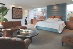
The big windows on either side of the bed in the primary bedroom were sized for two dressers: existing pieces of furniture Gray already owned. The primary bedroom provides access to the gym and one of three laundry rooms through the primary bath.
Challenges posed by the low ceilings went beyond aesthetics to performance. The only attic spaces consisted of two narrow cavities above the kitchen on one side of the great room and above the small wine room on the other. That central cathedral meant that the home needed two separate HVAC systems, and these small cavities would need to accommodate the needed air handlers and ductwork. To make it work, they opted for an engineered system that combined ducted and un-ducted mini-splits within ceiling cassette units.
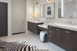
The room next to the primary bedroom is part of the existing house and used to be a guest bedroom. It’s now a contemporary bath.
The new HVAC setup helped the home achieve a HERS score of -22, meaning its new solar panels make much more power than it needs. (We will detail the performance upgrades in a future issue.)
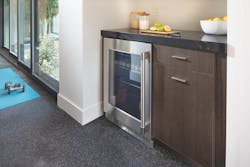
A home gym was added to the primary bedroom on the side opposite the bath. It overlooks the outdoor living space at the back of the house, with large doors that open to a sitting area beneath an overhead pergola. It also includes a small beverage center and bathroom.
Gray added several feet to the rear of the house and extended the ridge beam for the vaulted ceiling.
BACKYARD OASIS
When the sliding glass door is open, the outdoor kitchen becomes an extension of the main kitchen. Cooks and servers can move easily between them without bumping into guests.
The backyard was also an important part of the design. Gray described the pre-remodel space as “tropical,” with a variety of plants and a Koi pond. He wanted to keep some of that feel while also updating the space for today’s lifestyles and reducing the need to maintain so many plants.
The new space includes a swimming pool, fire pit, and two covered outdoor areas. The tropical feel is provided by a wall along one side of the yard. Gray didn’t decide exactly what to do with this space until the home was almost complete. “This part of the project evolved over time and included a lot of discussions between myself and other members of the team,” he said.
That blend of careful planning, attention to detail, and a willingness to adapt as things evolve are hallmarks of every successful remodeler. It went a long way toward making this project one to remember.
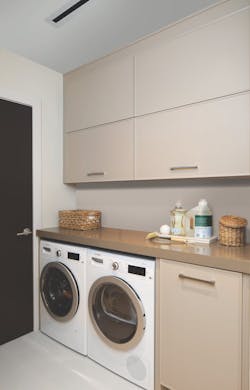
Small spaces often need to do double duty. A case-in-point is the space between the kitchen and garage, which serves as a mudroom with washer/dryer as well as a butler’s pantry.
The Price of Perfection
Although construction for this year’s New American Remodel has been mostly straightforward, there was one exception: the alignment of the existing home with the new cabana at the back of the property.
Remodeler Eric Gray, who lives in the house, says the great room at the center can feel “like a glass snow globe.” There’s no internal glitter, but there might as well be, given how many people stop and stare into the big windows at the front.
The great room’s geometry is unique, with a cathedral ceiling that expands in width and rises in elevation from the front to the back of the house, like a bisected half-cone laid on its side. Glass atrium windows fill the spaces below the gables at each end. This creates a sightline like that in a photo or painting, directing one’s eyes to precisely where the artist wants them. “It’s a visual magnet,” says Gray. “It pulls you in.”
To make that sightline even more compelling, Gray and architect Phil Kean decided to extend it. A pavilion roof on the cabana would mirror the geometry of the roof enclosing the great room, and the two ridge beams would visually align from the perspective of someone at the front of the house. Getting it right proved expensive.
Gray is an obsessive planner who draws architectural details on subfloors down to the 1/8 in. reveals on door jambs. “A complex project like this demands continual thought,” he says. “I’m here every day wrapping my head around the many, many pieces that go into it.” This lets him catch lots of mistakes before they happen, but of course, no one catches everything. One blunder missed was that one of the cabana’s CMU walls had not been built in the exact spot specified by the plans.
Although some remodelers would have lived with the mistake—the two structures are separated by 40 feet and a swimming pool—Gray and Kean deemed it unacceptable. The wall misplacement meant that the pavilion roof would now be 16 inches to the left of where it needed to be when viewed from the front of the house, eliminating that perfect sightline.
For the two ridges to align, workers would have to demolish and rebuild the cabana’s left-hand wall as well as part of its front wall.
To ensure a good result, Gray got up early. “I arrived at the house several mornings while it was still dark out so I could use a laser to see exactly where the new cabana walls and the pavilion ridge beam needed to be,” says Gray. Moving the walls also required some re-design of the cabana’s interior.
The lesson here is that great results come from knowing where you can and can’t compromise. “Good remodelers take the time to think everything through,” says Gray. “They look at things from all angles and do whatever it takes to make sure everything is done right.” The ridge beam is that principle in action.
This is just one example of how a focus on the details makes this year’s New American Remodel a must-see.
RELATED: Modernizing a Classic
Partner Companies
Platinum
Eaton: Residential Circuit Protection and Wiring Devices
Ferguson: Lighting/Outdoor Appliances
Mitsubishi Electric Trane US: HVAC, Heat Pump Equipment
Gold
NordicTrack/iFIT: Exercise equipment
BSH Home Appliances: Thermador appliances
RWC: SharkBite EvoPEX plumbing system
Wellborn Cabinet Inc.: Kitchen and Bathroom Cabinetry
Environmental StoneWorks: Exterior Stone
Bronze
Danver: Outdoor kitchen cabinets
Fi-Foil: Reflective Insulation
Jeld-Wen: Windows, Doors & Wall Systems
LiftMaster: Garage door opener
Omega Flex: Flexible Gas Piping
Propane Education & Research Council: Propane
Phantom Screens: Retractable Insect, Solar, Privacy & Climate Control Screens
Sherwin-Williams: Interior and Exterior Paint
