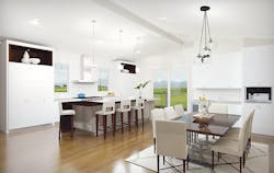
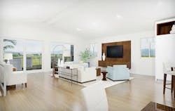
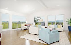
As the Model ReModel house enters the final stages toward completion, let's pause for a quick look at the design, particularly on the second level.
The visionary behind the space is Nicole Zavala, a project designer with Custom Design & Construction, in the Los Angeles area. Zavala, who has a degree in interior design, is very aware of the challenge put forth by this question: “How do I design a home that is timeless rather than trendy?” And along those same lines: “How do I create a space that has vision and impact, yet is flexible enough to grow and change with the homeowners?"
A View From the Top
When buying or remodeling a home, most consumers start with a number of nonnegotiable features that they want incorporated into the space. An open floorplan is a biggie.
According to a 2017 study from the National Association of Home Builders, a full 70% of buyers want a kitchen-family room arrangement that's either partly or completely open. The Model ReModel embodies that desire with its second-floor addition, a dramatic open space with a high, vaulted ceiling. The great room leads onto a large deck situated above the garage.
"The second floor provides a great opportunity for entertaining inside as well as outside with the open deck," Zavala says. "Keeping a light, airy feel in the whole home is a big trend today."
Another trend, at least in the beach community of El Segundo, Calif., where the home is located, is to place the bedrooms on the lower level reserving the public spaces for upstairs where guests and homeowners can take advantage of the view and ocean breezes.
"People spend less time in their bedrooms than they do in a home's living spaces," Zavala says. "This way, they can have privacy downstairs and enjoy the view and elevation with friends and family."
A Private Retreat
The home's first floor features four well- appointed bedrooms. The master suite, situated at the back of the house, opens onto an inviting—and very private—patio where the homeowners can linger in the morning over a cup of coffee.
Another trend, at least in the beach community of El Segundo, Calif., where the home is located, is to place the bedrooms on the lower level reserving the public spaces for upstairs where guests and homeowners can take advantage of the view and ocean breezes.
Near the master suite is a sort of secondary master, also with a full bath, that would be suitable for a teenager. The two remaining bedrooms share a smaller bathroom, equipped with a pedestal sink and shower.
A large laundry room, with plenty of storage, sits near the front door. Zavala purposely placed it away from the bedrooms so that the washer and dryer could be used anytime, day or night, without disturbing the occupants.
Focal Areas
When it comes to finishes, the home is exceptionally easy on the eyes. The same 24-by-36-inch tile flooring is used throughout the downstairs, upstairs, and deck. This not only makes the design more cohesive, but also brings the indoors and outdoors seamlessly together.
"The porcelain tiles are easy to maintain, and they look like limestone," Zavala says. "The color reminds me of sand. The house is close to the beach, and I wanted to keep a coastal design. It reminds me of things that we associate with California."
She adds that tile is perfect for a living area because the homeowners can add rugs if they want more color, and easily change them out over time to reimagine the space.
The kitchen area continues the home's clean, transitional design, creating a rich canvas for the homeowners to use as a backdrop for their own signature pieces. The backsplash features marble tile with chevrons of mirrored inlay that mimic antique glass. The tile runs from countertop to ceiling and wraps the window. When visitors walk upstairs and into the great room, they will immediately see the distinctive backsplash. "It was important that we added some beauty there to get your attention," Zavala says.
The upstairs powder room is another focal area. The space is defined by a soffit, and bold, floor to ceiling tile. Unlike the neutrals in other parts of the home, the powder room features white, navy, and beige marble in a floral pattern. Cabinetry is navy as well. "It's a powder room so you're able to make it more dramatic," Zavala explains. "It had to be fun and exciting because guests are going to use it."
Open the large, glass slider on a summer evening, and you won't know where the inside ends and the outside begins.
Another notable feature upstairs is the soaring tongue and groove ceiling that extends onto the deck with large eaves. The 16-foot, 1x6 panels are kiln-dried, primed fir. The light-colored boards add texture and are subtly in keeping with the home's beachy feel while the extension of the ceiling into the outdoor area further connects the two spaces. Open the large, glass slider on a summer evening, and you won't know exactly where the home ends and the outside begins.
Join us in our January issue for the big unveiling of this year's home, a peek behind the walls, and a deeper dive into first-floor design details.


