Kitchen Remodel: Vintage Done Right
This home was built for the owners of an organic farm in East Austin who wanted a modest space reminiscent of a vintage farmhouse, but without a dated feel.
“The idea was not to do a historical replica,” says Eric Rauser, the home’s architect, who worked on the project with contractor Matt Risinger, of Risinger Homes, in Austin, Texas. “This isn’t some sort of theater where we’re presenting ‘The Old House.’ We wanted scale and materials that harken back to a traditional farmhouse, but with modern touches that allow us to be less referential.”
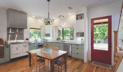
That concept starts at the front door. Typical suburban homes generally have a foyer, but an old farmhouse has no need for that formality. Rauser placed the entrance right at the kitchen to both create a vintage feel and maximize space.
The small kitchen table is sometimes used for canning, or as a place to sit while keeping the cook company, but the owners mostly eat outside in a dining area on the porch.
Whenever possible, the clients selected locally made products.
One striking example is the 100-year-old loblolly pine (also known as Southern yellow pine) floor used throughout much of the home. Reclaimed by a local millworks company, the floor was made from beams 18 inches wide by 30 to 40 feet long; true showstoppers in the current era where 15 feet is considered “extra long.” There were bolt holes at the ends of each piece, but rather than saw those sections off and scrap them, the ends were repurposed into side tables and other furniture for the home. The clients love the floor’s character, and part of the design’s intent was to create a space that showcases the timber’s knotty beauty and variegated shades of warm brown.
The cabinetry was locally made as well. Its distinctive color is inspired by the soft hue of the eggs that arrive daily from the farm’s chickens. The honed soapstone counters were left unfinished so that they will show the history of use over time.
One unusual aspect of the project is its layout. Rather than adhering to the classic kitchen work triangle with stove, sink, and refrigerator serving as the three points, Rauser wanted to highlight the separate phases of food preparation: prep work, cooking, and cleaning up.
“People begin with things like chopping, and that can be done while chatting with someone,” Rauser says, adding that that’s the perfect use for an island or peninsula. “Next comes cooking,” he says, “and there you start to get a little bit serious. That’s better against the wall, with materials around you.” The final space, he explains, is a spot to stack dirty dishes away from the prep and cooking areas. This configuration is more useful than the traditional triangle, Rauser believes, because it allows for differences in the function of each area and lets cooks easily move between one section and the next.
Incorporating Modern Appliances
Marrying contemporary products with a vintage design is always a challenge. One solution is to just live with the uneasy clash of styles, but Rauser didn’t like that idea. “You see the whole kitchen as soon as you walk in the front door, and I didn’t want people to immediately be smacked in the face by a very modern refrigerator,” he says.
Another possibility was to purchase new appliances that are made to appear vintage, but Rauser feels that those products have a self-consciousness that can set a false tone.
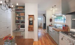
His answer to the melding of old and new: “Hide” some of the modern appliances so that they’re not as prominent. To that end, the refrigerator is tucked off to one side, opposite the first of two sinks. A microwave drawer was created to avoid the “appliance tower” common in many modern kitchens that feature a wall oven, microwave, and coffee maker built into the cabinetry.
Another tip of the hat to tradition is the woodburning stove set behind the kitchen. The house is efficiently warmed with a heat pump, but the farmers knew that they would be out working the fields on cold mornings and wanted to be next to a direct source of heat to warm their hands. The stove also offers the emotional appeal of being a cozy reminder of a simpler time.
The clients wanted two sinks, one for dishes and a “starting sink” right off the garden. Nearby, the pantry is stocked with all the necessary prep items. From there, cooks move to the cooking zone around the stove, and eventually migrate to the other sink to clean up and put away dishes.
Double-Duty
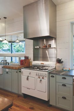
The vintage stove looks almost incandescent and serves as the kitchen’s focal point, fulfilling dual roles as appliance and art piece.
The property already had a house on it built during the 1950s with an old-school chambered stove. Rather than buy a new one, the clients sent the old stove out to be refinished and equipped with modern safety features.
“As with the entire kitchen, it’s all about ‘editing,’” Rauser says. “We wanted the range to have the feel of something old, but not actually fool anyone.”
To that end, he added a locally made contemporary rangehood designed to resemble a commercial installation. The boxy, industrial-style hood and the stainless steel backsplash create a strong counterpoint to the old stove. “The idea was to have a vintage piece framed by something clearly new and modern,” Rauser says.
The painted tongue-and-groove pine walls were purposely left unadorned to further highlight the stove’s beauty.
Some design considerations were more functional than aesthetic. Back in the day, stove heights tended to be low, and the clients are tall, so steel panel legs were installed to raise the rangetop. The countertops are higher as well.
The large butcherblock to the left of the stove is an eye-catching and practical detail that also visually ties in the countertop to the warm wood tones of the floor. PR


